As I had shot these images in JPEG+RAW I could experiment with adjusting colour cast with both. The first thing I noticed was that the colour cast was more obvious with the original jpegs.
The first image I chose has a yellow cast, although admittedly it isn't that strong a cast but enough that the skin tones are rather sallow and the blue sky appears a rather washed out murky colour. This was also an ideal image to choose as it has several surfaces that I could select as my grey point.
 |
| Original Jpeg file |
 |
| Original raw file |

I then used different techniques, different layers, changing the opacity and experimenting with the targeted adjustment tool, to obtain a satisfactory result.
 |
| Adjusted Jpeg |
 |
| Adjusted RAW file |
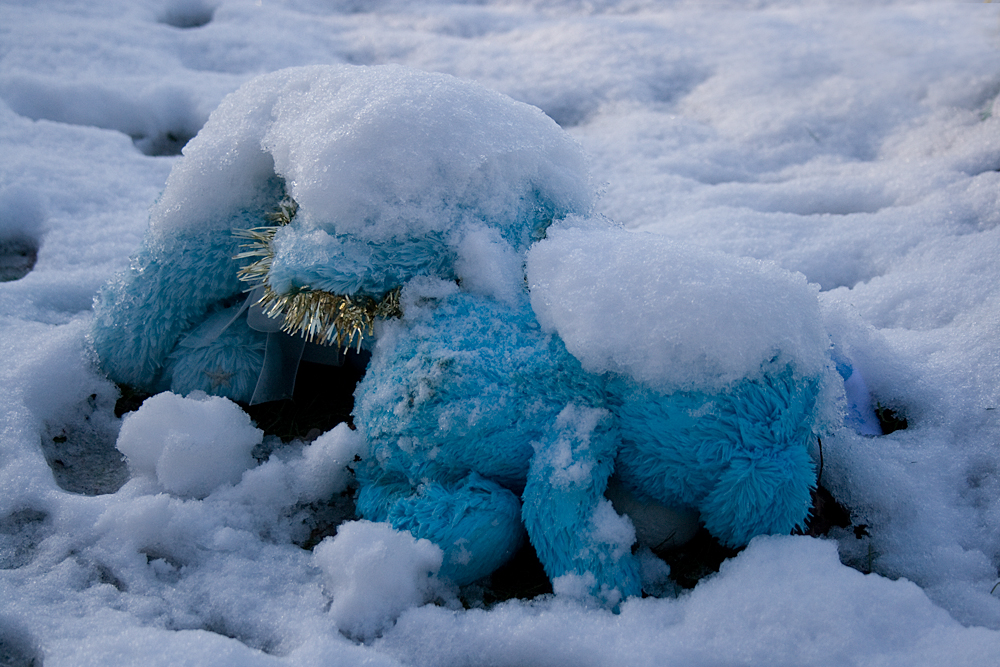
The second image has a distinctive blue cast. Once gain the colour cast is more obvious in the JPEG file.
 |
| Original Jpeg file |
 |
| Original RAW file |
 |
| Adjusted Jpeg |
Again I chose to adjust the whte balance slider and alter the hue. The difficulty I experienced with this image in RAW was keeping the colour of the bears correct, I tried to do local adjustments in RAW but they were not very successful. In practise I would have then opened the image in Photoshop and completed the adjustment with layers, however as this task was about the comparison of managing colour with either RAW or JPEG I left it as it was.
 |
| Adjusted RAW |
In conclusion I would still choose to do my main colour cast/white balance adjustments in RAW, once the techniques of all the tools have been mastered it gives more fine-tuned, subtle results than working with jpegs. Having said that at the moment I obtain better results when mixing both RAW, converting to a TIF and doing fine-tuning with layers and layer masks.
No comments:
Post a Comment