The original image was taken in the Limehouse Basin on a rather cold and overcast day at the end of September. Not a terribly inspiring photograph but it was ideal for this exploration of interpretative processing.
 |
| Original |
For the first adjustment I attempted conversion to a night scene, playing with so many different layers and processes even though I wrote some of them down I lost track of what effects were eventually used to complete the final image. I created layer adjustments and layer masks so that the original image was not destroyed during the process but in my experimentation the tiff was flattened and saved without saving with layers intact, which is a something that I never usually forget to do! The main effects used were; Exposure reduced and a cooling filter with the density increased added. Saturation was slightly decreased and the burn tool was applied to the lighter areas that remained a little too light. Using the black and white adjustment brushes on the layer masks or adjustment layers fine tweaks were made to local areas. I was rather pleased with the end result and believe the final photograph represents a late evening/ night shot well.
 |
| Night |
The choice for my second conversion was to create an image that would not look out of place in an old photograph album depicting a historic scene. Once more layers were employed. To create a sepia tone I used variations in the Image menu, in order to use this option the image had to be converted to 8 bits. In variations I moved the fine/coarse slider down a notch and selected more yellow once and more red once. I played with the opacity until I was happy with the colour. Noise was added and using the erase tool with a dry media brush faded/distressed the edges. A few scratches were added for effect and the burn tool was used in an attempt to make the edges look grubby. I was pleased with the final image,the sepia tone is realistic but the distressed edges could be slightly more subtle. If I was to undertake this exercise again I'd possibly use different brushes to make it look less uniform and also experiment with the eraser opacity.
 |
| Aged |
For the final change I wanted to create a sunset. To make this I used a New Adjustment Layer/gradient map. On the gradient editor a red was chosen for the dark areas and yellow for the light. The blend mode was changed to overlay and the layer opcaity reduced. Once again the erase tool or adjustment brushes were used on local areas. I am particularly pleased with the warm glow showing thru the yachts sails and the "sun" behind the clouds. The warmth that has been added to the building and water are effective, especially with the glints on the ripples. Having uploaded the image I think I could have toned down the orange on some of the clouds but for the aim of this excercise it proves that images can have different interpretations.
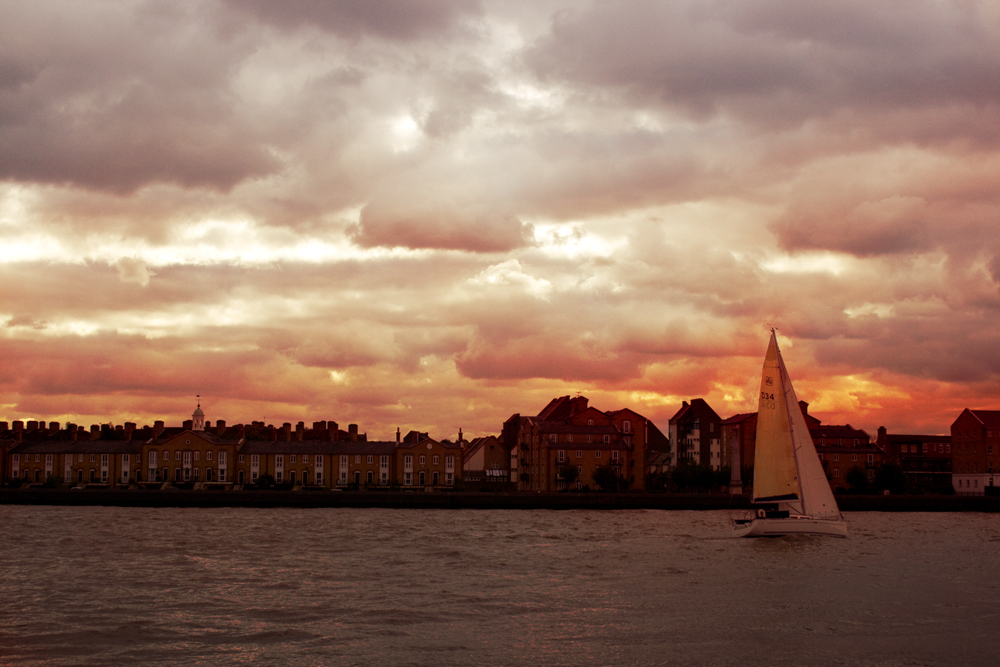 |
| Sunset |
I enjoyed the creative/artistic side of this task, it shows that the feel atmposphere and therefore effect of an image can be amended within photographic software. This means the original intention/interpretation of a shot can be altered. Even though on reflection some of the alterations on the sunset could have been toned down a little all images are completely different to the original and I feel I have been successful with the creative interpretation. I would probably use this technique if creating an image that I considered to me more a piece of "art work" rather than straight photography.
No comments:
Post a Comment