Wednesday 22 December 2010

Ethics of Manipulation - A Can of Worms?

I have thought long and hard about my own opinions towards digital manipulation and carried out some research into how others perceive its use. This website http://www.poserdesign.net/blog/?p=86 made for very interesting reading and I found myself agreeing with the responses being given by Tracy Ann Walsh, a freelance photographer, on her blog.What makes the difference between a positive use of photo manipulation and an abuse of it? Take for example the manipulation of the 1994  O.J. Simpson mug shot on the cover of Time magazine, was it just to create a more "artful" image or was the intention more sinister?

There is a difference between deliberate manipulation to deceive and innocent enhancements. As I stated in my previous post an image which is altered to deceive, especially if to promote a commercial product where the consumer would perceive it to be reality is wrong. An example I can think of that had to have a disclaimer on it which originally did not (although not photographic manipulation) was Cheryl Cole advertising shampoo with long shiny hair that was extensions....

Taking into consideration additions and subtraction, again I think it all depends on the extent of these alterations and why they were done. If in a wedding photo there was something distracting in the background, for example a sign on a wall or a litter bin, I can see no harm in it being cloned out, it has no bearing on the main subject and does not alter the intention of the photograph. However if the image was for a holiday brochure and the hotel had a nuclear power station in the background which was replaced by rolling hills then that I would consider misleading and unethical.

As far as portraiture is concerned I would remove blemishes/spots as they are not permanent features and everyone wishes to look their best, I would only consider removing moles etc if a request was made by the client. With the increasing popularity of digital photography people have become more sceptical about the images they see in everyday life.

Whilst understanding why this occurs, due to the ease of which digital images can be altered, I find it comical as photographic manipulation has been around since photographs have been made, the most famous example I can think of is the portrait of president Lincoln, which is actually a composite of Lincoln's head and John Calhoun's body. Some of the most spectacular photographs of World War I aerial combat were only recently exposed as fakes.Subsequent to that Stalin, Hitler and Chairman Mao frequently had enemies air-brushed from group photographs.

I am not mentioning these to condone them merely to indicate that photographic manipulation has been around longer than digital photography.The manipulation of photographs  is not new...

"It is rather amusing, this tendency of the wise to regard a print which has been locally manipulated as irrational photography – this tendency which finds an esthetic tone of expression in the word faked. A MANIPULATED print may be not a photograph. The personal intervention between the action of the light and the print itself may be a blemish on the purity of photography. But, whether this intervention consists merely of marking, shading and tinting in a direct print, or of stippling, painting and scratching on the negative, or of using glycerine, brush and mop on a print, faking has set in, and the results must always depend upon the photographer, upon his personality, his technical ability and his feeling. BUT long before this stage of conscious manipulation has been begun, faking has already set in. In the very beginning, when the operator controls and regulates his time of exposure, when in dark-room the developer is mixed for detail, breadth, flatness or contrast, faking has been resorted to. In fact, every photograph is a fake from start to finish, a purely impersonal, unmanipulated photograph being practically impossible. When all is said, it still remains entirely a matter of degree and ability. - Edward Steichen - Camera Work 1, 1903. [cited in: Alfred Stieglitz “Camera Work (The Complete Illustrations 1903 – 1917)”, Benedikt Taschen Verlag GmbH, Köln, 1997, p. 107]

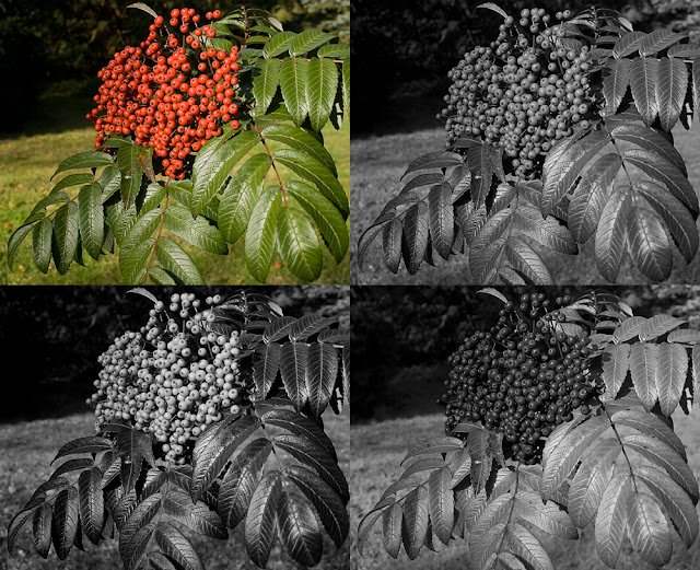
Photographers manipulate a scene from the moment they decide to frame the shot omitting certain elements or even the depth of field to obscure the background.

Many photographs are made for artistic purposes. As an art form these images should be be subject to the freedoms that the description implies. Artists, including painters and sculptors, routinely create a representation that differs from reality. These artists think nothing of adding, subtracting or enhancing elements from the original scene, in my opinion the artistic photographers such as Erik Johansson and Joan Charmant should be allowed the same freedoms. Advertising/artistic manipulationcan also be successfully combined as Jon Compson proves.

When it comes to news or documentary photography ethics become a totally different issue. I would personally not consider altering any image that the intention was to accurately and honestly portray a person, place or event.The National Press Photographers Association agrees with this point of view; part of their Code of Ethics ...

Visual journalists and those who manage visual news productions are accountable for upholding the following standards in their daily work:
  1. Be accurate and comprehensive in the representation of subjects.
  2. Resist being manipulated by staged photo opportunities.
  3. Be complete and provide context when photographing or recording subjects. Avoid stereotyping individuals and groups. Recognize and work to avoid presenting one's own biases in the work.
  4. Treat all subjects with respect and dignity. Give special consideration to vulnerable subjects and compassion to victims of crime or tragedy. Intrude on private moments of grief only when the public has an overriding and justifiable need to see.
  5. While photographing subjects do not intentionally contribute to, alter, or seek to alter or influence events.
  6. Editing should maintain the integrity of the photographic images' content and context. Do not manipulate images or add or alter sound in any way that can mislead viewers or misrepresent subjects.
  7. Do not pay sources or subjects or reward them materially for information or participation.
  8. Do not accept gifts, favors, or compensation from those who might seek to influence coverage.
  9. Do not intentionally sabotage the efforts of other journalists.
John Long the Ethics Co-Chair and Past President NPPA Sept 1999 wrote an article on Ethics in the Age of Digital Photography which covers some of the issues highlighted in this post.

The recent student riots has provoked many a debate; The media hunting pack | Green Wedge, notice how these published images have all cropped out the semi circle of photographers apparent in the original? Telegraph . The importance of fair reporting and the fairnesswith the associated photography to back up these stories is of paramount importance.

In quite recent times many photo journalists have been stripped of prizes or dismissed from publications due to faked or manipulated images. The degree of manipulation varies so where would you draw the line?

Robert Capa's photograph entitled Fallen Republican Soldier, Spain 1936 — Alistair Scott's PhotoZone

World Press Photo Disqualifies Winner

Altered Images - FamousPicturesMagazine

Toledo Blade Discovers Dozens Of Doctored Detrich Photos

In conclusion I feel that asking questions can actually raise more, and some that cannot be easily answered. My own personal opinion is that within certain areas and within the boundaries of Art or personal 'gratification' maniupulation is not a bad thing and can produce some stunning images. However for the purposes of documentary, news reporting or images purporting to represent reality, enhancements should be kept to the minimum.

for light relief....

Photo Fun - Real or Fake Image Game - LIFE
Beauty, Fashion and Portrait Retouching by Gry Garness
Retouching by Gry Garness: Digital Colour & Photoshop Color Retouched

Exercise 20: Improvement

Intervention in photography moves from adjustment of the basic qualities to actions which, in our eyes makes the image look better. In other words interpretation. Local adjustments can be made to a specific area of an image. Once again the premise of making local adjustments in nothing new, with dodgy and burning being traditional techniques used in darkroom printing.

There are various methods in which to make local adjustments and selections. Some are more automated than others. Our own personal perception has a lot of influence over what is selected and the level of adjustment made.

For this part of the project I needed to take a portrait of a person and select the area of just the person. Having made the selection and any necessary retouching to refine the edges, I needed to make the image stand out more clearly from the background whilst remaining realistic.This is the digital equivalent of traditional dodging and burning and widely accepted as the norm.

The portrait below is of my son at the local heath. He was sitting in the shade on a slightly overcast day, the unedited image is a little flat and could benefit from some basic adjustments.


Unedited Version

I decided to approach the local adjustments on two levels; to make the background slightly darker and to make areas of the main subject slightly lighter.  To make the selections Quick Mask mode was utilised @ 100% opacity but with a feathered brush. Each local adjustment was selected individually, rather than the person as a whole, to allow for more control. A total of five layers were created, each with a layer mask so edges could easily be refined. A Curves adjustment was applied to alter the contrast and density. Refinements were completed using the Brush Tool on the layer mask

Layers

The improvements made were minimal as to keep the image natural looking and not alter the original image in the extreme, the intention of the improvement was to give an overall improved result, not produce
a creative alternative version of the scene.
 
Edited Version
To demonstrate how the image is now lighter and stands out from the background but has not been radically altered I have shown them here side by side for comparison.

Side by Side for Comparison

I have no doubts that as far as this image is concerned these adjustments are perfectly legitimate, reasons being: 
  • The same or at least a similar result could have been attained using a fill in flash.
  • As previously mentioned these alterations are no different to the darkroom techniques of dodging and burning.
  • There has been no addition or subtraction and the content/meaning of the image remains the same.
  • The selection and alterations were made based upon how the scene was viewed/remembered by the human eye rather than how it was captured by the photographic equipment.
The ethics behind alteration is something that provokes strong emotion/debate and I shall comment on this more fully in another post, for the time being I would say that in conclusion even "simple" alterations such as contrast and dodging/burning can be used in the extreme to alter the meaning of an image. If these alterations are merely for artistic purposes I can see no harm in it, however if used for political gain or to erroneously sway public opinion/ mislead this is where problems can arise.

Exercise 19: Correction

All images be they digital or film need to progress from capture to display. The techniques employed in between IE the processing, is when intervention can move from insignificant to significant. The basic image qualities are

  • Overall brightness
  • Overall Contrast
  • Density or blackness of the darkest tone
  • Density or whiteness of the lightest tone
  • Overall colour cast - white balance
The raw file is often compared to that of a film negative, both being the intermediate stage between capture and display. Correcting any of the fundamental image qualities is accepted as the norm or the standard and no-one argues against optimising any of these qualities. However when does correction begin to move from basic correction through to interpretation and creating an image far removed from the initial scene capture and depart from the "standard"?

For task 19 I need to investigate two widely accepted reasons for correction; dust spots and lens flare. There are several images taken recently that have blemishes; I change my lenses quite frequently and recently discovered that at smaller apertures I obtain more noticeable dust spots in areas that lack detail such as plain backgrounds and clear skies. I feel a trip to the camera shop for a spring clean!

Dust Removal

This image of a boat in a frozen lake has a few dust spots visible in the sky and on the ice. There are several tools in photoshop which you can use to remove dust spots but the ones I favour are the healing brush and the clone stamp tool.


In this instance I used the healing brush to remove the dust spots in the sky and a mixture of the healing brush and clone stamp tool for the dust spot on the ice.

When making these minor adjustments I still like to keep the 'innocence' of removing dust and retain as much of the detail from the original shot as possible. Dust on the sensor is not part of the scene and is down to equipment 'failure' and I see no problem with removing dust spots.

As you can see from zooming in at 100% on the before and after images removing the large blemish from the ice has not altered the scene at all.

Lens Flare

Lens flare is not always a mistake on the part of the photographer, occasionally it can be used to create an atmosphere or for artistic reasons. In my photography I have a mixture of both, sometimes the mistakes add to the image and sometimes the deliberate inclusion does not always have the desired affect! Removing lens flare can be tricky. Depending on where the lens flare falls depends on the tools you can use to try and remove it. Sometimes the clone stamp is the best option and on occasion I have used marquee tools for precise selection either to adjust the selection or duplicate an adjacent area to 'cover' the flare.

This woodland scene was shot early in the morning as the sun was rising. The intention was to catch the suns rays in a starburst effect from behind the trees. Not using a lens hood I had expected to get lens flare and I was interested to see what the actual effect would be. I had not anticipated the large white glare at the bottom, which at the time I felt detracted from the overall image.

For my own satisfaction I faded the white flare so it blended in and was not as obvious but felt the lens flare did not spoil the final image and let it remain. Shooting at this angle into the sun you would expect lens flare to occur and naturally be part of the scene.
I felt this would be an ideal image to use for this part of the exercise. I have never used the clone stamp tool with different modes before so I was interested to see how it coped in this situation. Experimenting with both Lighten and Darken I found it not very successful, due to the intricacies of the light and shadows of this scene. I therefore reverted back to straightforward cloning in 'Normal' mode. This was also a very fiddly job but I was more satisfied with the results. This maybe because this image lent itself more to Normal mode or because I need more practise with other modes.

So the question to be answered is "should lens flare remain?" In the case of the above image the intention was for it to be there, has the image lost anything from it being removed? I personally prefer it with but can see the merits of its removal. Do I think the image is now not as honest? In reality nothing has physically been removed from the scene, a few blades of grass or leaves may not be in exactly the same place but no trees or fence posts have been removed, in essence the scene is the same as it would have been had I slightly altered the camera angle therefore ethically, in my opinion, I don't this there is anything wrong with removing lens flare. Is it necessary to remove lens flare if it is a mistake? I don't always think it is, but if distracting from the main subject then I can see why in some cases it would be better to be removed.

Project 4: Reality and intervention

Reality. What is real? Is it real? Something you can ask in any given subject but once associated with photography throws a different light upon the subject (no pun intanded). Compared to film photography a digital file is always open to alteration and adjustment.

Explored in the previous projects were the concepts that from the moment you pick up your camera you are fully in control of what is captured, how it is captured and the final processing , therefore manipulation of content and meaning can be open to abuse. How is an audience to know what is the "truth"?

There are many examples of images, and not all from the digital age, that have had significant or even insignificant changes which have altered the context quite considerably.

Is all intervention to be frowned at? The next set of exercises are for me to explore the practicalities and ethics of manipulation and to judge those which I consider appropriate or acceptable in given situations.

Assignment 3 Feedback

Full Feedback can be found on the Tutor Report Page :o) Once again I am really happy with the feedback and suggestions given :o)


Overall Comments

Hi Jan,
Thank you for sending in your third assignment. As usual I have had a brief look at your images on your blog and they are of a very high standard indeed, so it is going to be difficult for me to advise you as to how you can improve. With quality images like these you should do well at the assessment if you decide to go for it.

Going to Work on an Egg

Peter has made a comment that to improve pictorially, I could remove one of  the traffic cones so that I only have five components for the shot as for some reason odd numbers always give a slightly better composition. I never realised that so will clone one out and see what the result is :o)

I chose to clone out the far right as I liked the angle of the other cone. Had the original scene been made up of only 5 elements I may have spaced them slightly differently so although I can see the effect of having an odd number of elements I think I prefer the original shot.


Then experimenting I cloned out the angled cone. I think this is a better spaced composition however I do like the other cone better :o/


Then to play even further I created a duplicate cone which I placed in the frame, the reflection "falls off" but it does give an odd number of elements. I think this is too busy but was only to see what the effect was rather than a serious rework :oP


In conclusion I think I'd stick to my original image but remember in future to think of the "odd number" rule.

*amendment* doing a final review of this several months later I actually quite like re-work number one but still not entirely happy with the spacing in the frame am still sticking with my original shot ;o)

Painting by Numbers

Only a minor comment that the fern is possibly a shade too close to the edge of the frame, I cropped the original image to bring the fern into the corner a little more so easily remedied.

Gravy Train
Comment was ...This one to me is not quite as good as some of your other shots, but it is still very good. Technically perfect, I would liked to have seen the train on the bridge come just a bit more into the frame so the viewer could see the Oxo cube a bit better. The only other thing that bothers me slightly is the way the track continues out of the frame as it tends to lead the eye out and is therefore a bit distracting.

This image I did have issues with constructing. Originally I did have less track but I was not happy with the composition and added more, possibly a mistake...I had wanted to make a complete circle but with the bridge made the scene to large, building the track with the bridge gave added height and interest. I'll see if I can clone some out without it appearing too odd, The train I did alter from one direction to another which impacted on the view/angle of the OXO cubes, bringing it further down then made the train on the track affected the reflection of the train in the background and the reflection of the train itself within the frame, so a compromise was made ;o)

The track just ending at the bridge seems odd although the piece of track cloned out at the back seems an improvement so I tried another version with leaving the track running off the frame under the bridge but removing the extra at the back.

for a comparrison here all all three side by side. I think I prefer the second rework of just the small piece of track removed. Although a piece of track does lead the eye out of the frame to the lefthand side it does "join" up with the reflection of the bridge which should lead the eye back in.


Assignment 3: Monochrome Review

Idea/Theme

All the exercises in this project have been to do with recognising tones, the strength of interpretation and understanding how the practical use of channel adjustments can help fine tune black and white images, also to understand the creative effect of a monochrome image.

Due to weather and outside lighting conditions not being very favourable I decided to create a still life theme once more. For this assignment I set myself the challenge to include humour (well they made my mum smile!), objects which were nostalgic, children's toys familiar to me and probably the majority of any prospective audience, mixed with common idioms, whilst also exploring the monochrome image qualities of form, tonal contrast, texture and possibly key.

The ideas I had were many and varied but some were not achievable, either because I was unable to secure the correct props or they just did not translate as well photographically as anticipated. Wanting to experiment with either shadows or reflections, open-minded as to which, I purchased a piece of perspex to stand my subjects on.

The Set Up

My dining  room was again converted into a temporary studio, table pushed against the window, black or white fabric used as a backdrop, perspex laid flat on top, and this time with the added bonus of a small light box and two small lamps with daylight bulbs. Working with several small items, some slippery, masking tape and sticky pads were employed where necessary. Camera, tripod, release cable, macro lens and 70-300mm lens were used.

Workflow

Workflow as before, check all equipment, arrange set up, shoot images, check whilst shooting, re-shoot if needed, edit, process.

Final Images

Due to consistent lighting conditions and a similar set up with all the final images I used my 100mm macro lens  and an aperture of f29 for all except for one, as this provided the required depth of field. Lucky to have held onto several of my children's and my own personal childhood toys I was able to incorporate some in each scene, hopefully adding the humour and recognition. These props also added the texture/repeat patterns that I hope would create a final interesting monochrome set. All images were shot using Jpeg+Raw, opened in ACR for basic correction if needed and then processed in Photoshop using the Black and White Adjustment layers and other Adjustment Layers as required. To have a balanced set I hoped to create 3 high key images and 3 low key.


1) Going to Work on an Egg


ISO 200 100mm f29 2 Seconds

Playmobil workman were the chosen toy for this shot, using my new light box for the first time. Setting it up and using the daylight lamps did make cutting out stray light and controlling specular light and unwanted reflections an easy process. Although a fairly simple scene with only six elements it did take a while to assemble to my satisfaction, deciding to go for reflections utilising the perspex ensured that I had to position the camera to include all of the reflections and take care that the reflections themselves added rather than detracted from the final tableaux. Test shots were taken to achieve the correct exposure for a higher key result. Following my usual workflow the final photograph was selected for conversion. Difficulties encountered were with the white elements getting lost in the background so careful local adjustments were made with contrast and the dodge and burn tool. One of the workmen originally wore a white hard hat so I took another frame, having swapped the hats over and merged the 2 images together. Several B&W adjustment layers were used to provide the tonal contrast and a final contrast layers were used to bring out even more detail and make the items "pop" slightly more. The colour slider alteration to the reds dramatically improved the tones on the traffic cones, road sign and writing on the egg. On reflection I am really pleased with this final shot.


2) Pay Peanuts You Get Monkeys


ISO 200 100mm f29 4 Seconds.

This is the original 1970's Pick Up Monkeys game, the idiom "You Pay Peanuts, You Get Monkeys" came straight to mind, the Monkeys provide the game element, a repeat pattern and once again the opportunity to show the creative effect of using the colour sliders. The shelled peanuts have a great texture. Light box and side lamps were used to light the scene. Once more construction for a pleasing composition took a while, difficulties faced were the barrel kept rolling, which I solved by using a small piece of BluTac. Ideally I would have like more of the monkeys' features to be on show but there was a compromise to camera angle versus reflections. I did consider propping each monkey at a slight angle using sticky pads or BluTac but these also reflected in the perspex and the complicated reflections were very challenging to clone out after. There were only four of each coloured monkey in the barrel therefore I moved a blue monkey from one end of the row to the other , re-shot and merged the two images together. Several black and white adjustment layers were used, as well as contrast, and the dodge and burn tool was used to create more of a dramatic effect on the shelled peanuts. I was pleased with the overall composition, but can see that it could be improved by seeing more of the monkeys, and as an after thought I am wondering if I had included a few pennies at the front of the frame in the left-hand corner there would have been a little more emphasis on the money/payment aspect of the idiom.


3) Painting By Numbers


ISO 200 100mm F20 0.6 seconds

Playmobil, Lego, magnetic numbers and paint, combined together make "Painting By Numbers". For this scene I decided to add shadows to the elements as well as reflections, therefore I removed the light box and used not only the side lamps but also the spot lights in my dining room. Setting this tableaux up was great fun, posing the model interesting, ensuring all shadows and reflections worked together was time consuming  and challenging but I am really pleased with the end result; the curving lines of the potted palm shadows/reflections and paint brushes all lead the eye around the frame. To complete the image an extra frame was shot to capture the paint spilling from the tube, a section of the original photograph was cropped, a filter applied to make a line drawing effect and applied as a layer to create the painting being completed by the "numbers." 

It took several attempts to get the correct exposure on this scene. I started to process a chosen image but when I altered the contrast some areas were still appearing darker than I wanted and changing them locally using differing methods/layers/cloning were not producing the desired result so I scrapped it and re-shot using a different aperture and creating a higher key slightly more exposed image. This was much easier to process. Black and White adjustments layers, a curves layer, a contrast layer and dodge and burn were all used in post production.

I was really pleased with the final image and I can't decide if my favourite shot from the high key images is the simplicity of Going to Work on an Egg or the composition and twist on Painting by Numbers.


For the next three images I decided to experiment with low key scenes utilising a black background.

4) Cool as a Cucumber


ISO 200 100mm f29 10 seconds.

The original idea had been create a scene including more cucumber ice cubes, however despite following numerous instructions on how to obtain clear ice all were turning out cloudy. Still wanting to use it as a concept I changed tack and raided Barbie's clothes and equipment to make "cool cucumber" characters and used the ice-cube as a table. I did not use the light box due to the lower lighting conditions caused by the black background, this meant taking care with the angle of the lights to not have light reflecting in the perspex or specular lighting on the cucumbers. The shutter speed had to be increased to allow the correct exposure. Several Black and White adjustment layers were used, a contrast layer, curves layer and finally a little dodge and burn to bring out the texture and tones on the cucumber skin. The only minor problem with this shot was the ice cube melting and slipping on the smooth surface. Sticky pads placed behind to "frame" it helped to secure it's position. I was really happy with the composition and subject matter, the lighting/shade on the ice-cream showing its form and shape using a contrast layer really brought out the reflections.
5) These Boots are Gonna Walk All Over You


ISO 200 70mm f29 13 seconds.

Walking boots and magnetic letters made for a very simple composition. Although very few items included the problems I encountered were the size of the subject and inclusion of the reflection; I had to change the lens length (using a focal length of 70mm) and the orientation of the camera to be able to include the height of the boots and the full reflection. The orientation of the perspex was also altered due to the reflections "falling" off the edge. My initial idea had been to spell out the word YOU in capital letters but none of these would remain upright so lower case were used instead.

The boots were too large to fit in the light box so once again I took care over extraneous light. Black and White/Contrast layers were used in the final processing. I am really pleased with the sharpness of the boots and details in the reflections.  The inside texture of the boot add interest as do the laces being stripy; I don't think the final result would have been as satisfactory if they had been plain.

As previously stated some of my initial ideas did not work either photographically, unable to find props or unable to incorporate the elements to make a coherent final set. This was one of my stand-by ideas which I ended up using. Although a pleasing image I think this is the weakest "idiom" in the set.

6) Gravy Train


ISO 200 100mm f29 5 seconds.

A wooden train set and oxo cubes.....in my warped imagination made for a Gravy Train. Again the composition was too large for the light box so great care was taken with the lighting especially as the Oxo cubes were very shiny. Several test shots were taken and time was spent setting the scene and ensuring the reflections were correctly postioned. At one stage a completely processed final image was reviewed and being not happy with at all deleted it and reshot with a slightly different layout. The direction of the train was altered to coming down the hill rather than going up, which took your eye out of the frame with nothing to lead it back in, extra track was added which I felt assisted with the overall set up and leading lines.

Quite a few Black and White Adjustment layers were used to process this image as the trains and carriages were of several different colours and shades. A contrast layer brought out the reflections and the detail in the train track. This was further brought out by using the burn tool. I think this is my favourite image from the whole set.


Conclusion

On reflection I was, on the whole quite pleased with the 6 images finally produced. Having never had to produce a set taken intentionally for conversion it was interesting to see what worked and what didn't. The use of the colour sliders proved invaluable as in all my photographs were very "busy" when in colour but once converted had very similar grey tones. Although this made for extra work in post production I feel it was worth all the adjustment layers it took to provide tonal contrasts and added interest to the final shots. I particularly liked the effect that increasing contrast had, especially to the wood grain on the train set. If I were to shoot a similar theme/subject again I would probably still consider using items of differing colour as it was the shapes/textures, reflections and narrative of the images that were of more importance. Because there is no distraction of colour I concentrated hard on including interesting shapes and textures and making sure that the compositions had movement and leading lines.

I wanted to experiment with different backgrounds and lighting situations and shooting this final set re-iterated that monochrome images are more forgiving when pushing contrast, curves or levels in either direction. When considering the final results I have a definite preference for the low key images with the black backgrounds. I am not sure if this is due to liking the overall artistic feel of the dark images or because the reflections/contrast and detail seemed to be much stronger in these. The higher key images with the white background don't hold my interest as much although I like the ideas and the compositions.

In conclusion I feel the final photographs meet my initial ideas and the brief of the assignment to explore tone, texture, contrast, form and key. I have gained a greater insight into the creation of monochrome images and the elements required to produce a sucessful image. Creating still life images also enabled me to review/alter compostion and lighting effects until I was really satisfied with the end result. The importance of reviewing images and being prepared to scrap an idea if it hasn't worked was also an important lesson learnt.

Thoughts on Assignment 3

Thinking about what I am going to do for the monochrome exercise has been very interesting with my mind jumping from one idea to another. Flicking once more through some of the B&W photography books borrowed has helped. Some have better images in than others, while the bulk of the books themselves seem to be more about the production of the images rather than choosing suitable topics. So many things can successfully be converted into black and white as long as they fulfil the main criteria of being a good image in the first place. Obviously the previous exercises have shown that when considering subjects for black and white conversion you disregard colour, can be aware that you can post process and “abuse” images more in B&W and consider more in the way of form, shape and even abstraction.

 In “Creative Black and White Photography Advanced Camera and Darkroom Techniques” © 2003 Bernhard J Suess Published by Allworth Press, it was interesting to note that “Among all photographers—professional and amateur—black and white accounts for less than 10 percent of the photos that are taken”

A question asked is “How do you know when the shapes and forms in your black and white composition will be effective?” and the answer given is “The best way to pre-visualize the impact of shapes on your photos is to practice separating form and function. In other words, try to forget about the subject matter of your photo as you abstract a composition from the shapes in front of you.......I try to invent humorous stories about the objects. If I can succeed in inventing plausible alternatives, then it is very likely that I can sit back and “cancel out” both this everyday world and my invented alternative.”

Important things to consider....

• The graphic content of the image is clearer without the distraction of colour.
• A great contrast is being presented between darks and lights.
• Shadows play a big role in the image.

Bearing these in mind I think I want to explore the use of light/shadows, reflections, maybe High and Low Key and try and incorporate humour or some kind of “recognition” within the image linking it to a well known phrase or saying. I have seen quite a few images where the comparisons have been texture or pattern and I would like to see if I can steer away from this and play with shadows and light. This is why I think I am leaning towards still life again, where I will have more control over the lighting conditions and composition.

Another book I found very interesting was “Mastering Digital Black and White, A Photographer’s Guide to High Quality Black-and-White Imaging and Printing” Amadou Diallo c 2007 Thomson Course Technology, which opens with a selection of the authors own images. Fine examples of black and white imagery concentrating of form texture,light, pattern and composition.

Within the book Diallo includes interviews with Chester Higgins (photographer) , Paul Roark (fine art photographer specialising in landscapes) Roy Harrington  (photographer and print maker),  Jean Miele (photographer) Alex Forman (photographer), Jeanne Greco (designer) and Philippe Dollo (photographer). I have had a quick look at all their websites and noted those that I think I shall investigate more, for example Chester Higgins has a wide variety of B&W images as does Paul Roark, Philippe Dollo's
New York, the Fragile City has very grainy images all suggesting movement.

His comments with regards to the final portfolio was also interesting; “At its core, the portfolio tells a story to your audience. Like all satisfying stories, this narrative should have an arc that compels the viewer to turn the page. Now that a selection of images has been made, it’s time to look at how they fit together to create a unified whole.” (p332)

Photographers I looked at for inspiration were.....

Carl Kleiner for his humour and different outlook on everyday objects. The way he combines elements and the composition.

Nils Jorgensen again for his humour and amazing timing. Although not still life and not always black and white the way he composes his images to take advantage of the humour is brilliant.

David Chow for simple composition, use of light and plain backgrounds.

and also

Robert Mapplethorpe  whilst most may immediately think of his nudes and controversial S&M imagery Mapplethorpe had a varied portfolio of flower and statuary studies as well as childrens portraiture. Once again his use of light, shadow and composition is amazing whatever his subject.

Sunday 12 December 2010

Location Portraiture

I recently completed a short six week course on Location Portraiture run through Bexley College. It was interesting and challenging on many fronts. The biggest challenge was down to the fact the college ran the course at this time of year rather than at the end of spring when the tutor had envisaged it taking place! Due to it being an evening class and too dark with inclement weather taking photographs outside was rather limited and two of the planned lessons had to be scrapped/re-organised due to only being able to shoot indoors.

It was enjoyable working and learning within a group again, bouncing ideas of each other and critiquing each others work. Mini assignments were set, I think the worst was handing over my camera to someone else and allowing them to photograph me! My son obliged and the result is my profile picture. I subsequently converted it to black and white to practise skills learnt in this part of the module.

A later part of the course covered exploring the edges of the frame and not centering the model. So experimenting I extended the frame.


I also practised on friends and revisited some earlier shots not taken for this course.


Another challenge was to walk around the college, find a fairly bright lighting condition with a bright background and create a high key portrait.


The last session was supposed to have been outside learning to use available light and reflectors but as previously mentioned this couldn't happen! We therefore had a studio setup with three tungsten lights trying to create the feel of consistent bright outside light. I didn't do very well! I think it was a case of too many cooks spoil the broth, I couldn't get the angles I wanted, the light where I wanted and the model kept blinking... I have a plethora of eyes closed shots! It was helpful to see the difference between using gold/silver/white and sunlight reflectors. I would like to improve the portraits I take but am now convinced that set up studio portraiture is NOT my calling ;o)

Several photographers were discussed and some were new to me such as William Kline, Larry Sultan, Tina Barney and Tom Hunter.

William Kline

William Klein career has encompassed groundbreaking  photographs of New York, fashion photography, and proto-Pop films. He has been described as idiosyncratic and experimental.
 
Born in New York in 1928, at the age of 20 William Klein went to Paris to study under Fernand Leger, who encouraged his students to reject conformity and the traditional gallery, and go out and work on the streets.
 
As an artist using photography, during the early 1950’s Klein set out to re-invent the photographic document. His photographs were often blurred or out of focus, and his deliberately over-exposed negatives, the use of high-grain film and experimenting with wide angled lenses shocked the established order of the photography world.
 
In 1954, Klein was approached by the director of American Vogue, Alexander Libermanto. He returned to New York to make a ‘photographic diary’ of the city. Financed by Vogue, Klein - who had never photographed fashion before - was surprisingly also given a contract as a fashion photographer for the magazine.  Vogue was shocked the raw and real view of the city he produced, and others saw it as photographically incompetent. Kline took the work back to Paris and managed to find a French publisher who brought it out as a book, entitled ‘New York’ in 1956. Now a much-sought-after collector’s item, this publication was also published in Italy the same year, and went on to win the Nadar prize.
 
Klein produced three other books of photography after this: ‘Rome’ (1960), ‘Moscow’ (1964) and ‘Tokyo’ (1964).
 
Despite Vogue’s reception of the New York streets work, Klein worked for the magazine as a fashion photographer for 10 years between ’55 and ’65. Klein preferred to photograph his models out in on location and, not particularly interested in clothes or fashion, used this opportunity to introduce new techniques to fashion photography that are still used today, including the use of wide-angle and long-focus lenses, long exposures combined with flash and multiple exposures.
 
From 1965 to the early 80’s, Klein abandoned photography and primarily concentrated on film, returning to still photography in the 1980s.
 
Prizes in the 1990’s included the Hasselblad Prize and the Agfa-Bayer/Hugo Erfurt Prize and also during this time he created ‘In & Out of Fashion’, a mixed media project including drawings, photographs and film, which was published simultaneously with shows in London, Paris and New York. In 1997 he re-photographed New York and had shows in Barcelona and Paris. In 1999 he was awarded the ‘Medal of the Century’ by the royal photographic society’ in London.
 
Viewing his images on-line I think I shall have to see if I can find any library books on him. I find myself drawn to all his images, he is proof that you can capture images of things you are not sure of, you can break the rules, you don't need razor sharp images to produce a fascinating and insightful body of work. His black and white images in Italy were stunning.

william klein biography

Larry Sultan

Larry Sultan was born in New York in 1946 and moved with his family to Southern California in 1949. He grew up in the San Fernando Valley. He received a BA in 1968 from the University of California at Santa Barbara and an MFA in 1973 from the San Francisco Art Institute. In San Francisco he was represented by Stephen Wirtz Gallery.

Not only did he have a teaching career completed commercial work for 'W Magazine', 'Vanity Fair', and other important clients, he also produced a large and widely influential body of personal work. His first major project was a collaboration with the artist Mike Mandel: a book of appropriated photographs titled  "Evidence"  The pictures came from the files of government agencies, corporations, and research institutions, offering a witty and provocative look at contemporary American culture. It wasn't until I started to check up on Sultan for this post that I realised I have come across "Evidence" when looking into other work.

In 1992 Sultan compiled the book and accompanying exhibition "Pictures from Home". The decade-long project began when his father, a vice president at Schick Safety Razor Company, was forced into early retirement. Sultan started by photographing his parents and their home lives, then also started to include extensive diaristic writing, family artifacts, and stills from his parents' home movies.

Working in the San Fernando Valley on "Pictures from Home" led Sultan to his next project, "The Valley", an investigation of suburban houses used as sets for pornographic films. "The Valley" was presented at SFMOMA in 2004 as a solo exhibition of more than 50 large-scale photographs shot between 1999 and 2003.

Sultan exhibited internationally throughout his career. His work is in the collections of SFMOMA; the Whitney Museum of American Art, New York; the Guggenheim Museum, New York; the Art Institute of Chicago; the Stedelijk Museum, Amsterdam; and Tate Modern, London. He received numerous grants and awards, including five NEA grants, a Guggenheim Fellowship, a Louis Tiffany Comfort Award, and a Fleishhacker Fellowship.
Not sure if I actually like his work :o/ Not sure if it is the style or the subjects? I love the lighting and his bold use of colours but as images I can't connect to them like I can with other photographers' images.

YouTube - Larry Sultan on The Genius of Photography

Tina Barney

When people say that there is a distance, a stiffness in my photographs, that the people look like they do not connect, my answer is, that this is the best that we can do. This inability to show physical affection is in our heritage.
— Tina Barney

I must admit that when I first saw Tina Barney's photographs that was the first impression I got. Very formal, very stiff, no-one looks totally natural/comfortable. But this is probably due to, as she states, their up-bringing and culture. Barney chose to photograph what she knew, and what she knew were her friends and family; the social elite of New York and New England. When examining her style it has the feel of a tableau and subject matter raises issues of privilege and the interaction of family members. Using a large format camera she would almost direct the subjects in her photographs. Apparently she was one of the first photographers to produce massive prints at 4 feet by 5 feet. I guess because I am so far removed from this world I find it hard to relate to the images or feel any emotion/interest towards the characters.

Born in New York in 1945 into "old money" and a society where wealth and society mattered I think you can tell this through the images Barney takes. The large prints enable you to view every object within the frame and these objects obviously tell us so much about the people who inhabit these environments.

Even if I can't relate to the subjects once again I can appreciate her ability to capture the essence of a world I have no access to, her use of lighting and colour is well thought out and executed, even the wariness of her subjects can be explained. Old money does not call attention to itself. "There is an overall feeling of old money that you have to guard it," Barney has said, "and I'm part of that."
This highlights what is important for her and many others. Cultural familiarity—knowing your subject, being comfortable in it, being able to make your subjects comfortable, it's an aspect of informal location portraiture  that's generally celebrated. Other examples of photographers who achieved this are Anders Petersen, who explored Hamburg's Reeperbahn district, or Juliana Beasley, who turned her stripper's background into a platform for a photographic series. They photographed the people they associated with, and gave their viewers a glimpse into a world they might not have witnessed otherwise.

If nothing else Barney has given us an insight to this world and eventually, sociologically this body of work may provide a window into history.

Museum of Contemporary Photography

I can see a fair few similarities in the work of Sultan and Barney.

Tom Hunter

Tom Hunter is another photographer who captures what he knows and takes images of the loacl people and their environment around Hackney. What I love and enjoy about his work is his ability to reference historical artists within his images.

Tom Hunter - Artist

He has several exhibitions on at present and I am going to try and get to at least one.

Saturday 11 December 2010

Exercise 18: Colours into tones - 2

The aim of this project was to make practical use of the channel adjustment to achieve a specific effect. I opted to use a portrait in which I lightened the complexion without significantly altering the tones of the rest of the image. In addition I had to prepare the image taking advantage of a default black and white conversion offered by photoshop.

The image I settled on was a portrait of my son taken during the portrait exercise in Project 1.


Original Colour

This is the original colour version.
Default Black and White

Alteration using one of the default settings within CS4, I chose to use a Black and White adjustment layer. The background appears to be darker, in this particular instance, when  converted to black and white. Skin tone also appears a little darker and the image to me, looks slightly flat. The subject no longer appears so "separate" from the background.


Default Channel Settings

These were the Channel settings before being adjusted.


After Adjustment

Not being too sure what effect each colour slider would have on the overall image I took a note of the original values and experimented, discovering the following for this image: -

Reds - made very little change to the overall image but significantly altered the complexion.
Yellows -  affected the majority of the image including the complexion.
Greens - a minimal adjustment to the background.
Cyans - again minimal adjustment to the overall image.
Blues - altered the white highlights in the background and the shirt collar.
Magentas - only seemed to affect the shirt collar.
 As I did not want to alter the background at all I decided to use two B&W adjustment layers. For the first layer I did not alter the channel sliders at all but only applied the layer mask selectively to the background. The second layer  both the Red and Yellow Channels values were increased; Reds to 126 and Yellows to 98.


Side by Side to Compare


Placing the two images side by side for comparison  shows how very subtle alterations to the Channels can improve default conversions. The changes made to Red and Yellow have made for a more natural looking complexion and helped to make the main subject stand out from the darker background. This exercise has also shown me how some Channels can effect more of an image than others. Converting to Black and White and making use of the adjustments available in Channels can make a seemingly uninteresting image more appealing/atmospheric and even allow you to rescue other photographs where you would be unable to correct the colours/tonal range without making the final result look fake.


Exercise 17: Colours into tones -1

To complete this exercise I had to take an image containing at least two strong contrasting colours, for example yellow and blue or red and green. Using the channel sliders or tools available in photoshop I had to create two opposite versions of the image in black and white.

In one I had to lighten the greyscale tone of one of the colours and darken the tone of the contrasting colour as much as possible. In the second version I had to perform the reverse.

It was recommended that this exercise was performed on a RAW image due to the direct access to the original three channels. A default greyscale image was created as a reference so I could note the effect that moving the sliders had on the entire image. It was also interesting to note what effect these adjustments had on the creative quality of the image.

Interesting and helpful webpage...

Understanding Colour 2 – Converting Colour to Black and White Tutorial – Photography Tutorials, News and Reviews For The Real...

Red and Green

As per the remit I chose an image which contained the strong contrasting colours of red and green.


Original Unedited colour version
 I then created a default black and white conversion which really shows how close in tone red and green are. Being told that red and green appear the exact shade of grey is not the same as physically seeing it happen.The straight conversion with no adjustment  is left with very little tonal range.


Default Black and White Conversion


The first adjustment I made was to increase the red tones and reduce the green. The effect this had on the image was to lighten the reds and darken the greens. I could move the green slider all the way to the left having a value of -200 and still retain detail, even though the leaves and background became very dark. Moving the red slider to the full extent lightened them too much as if the image was over exposed.


High Red Low Green
 Next the adjustments were made in the reverse, once again I could move the green slider to the extreme and still retain a fairly natural tone, however moving the red tones to the extreme left the berries completely black with no detail.

High Green Low Red


Adjustments to the extremes

Here are all four images together for comparison purposes.


My personal preference was for the high red/low green combination. I created a final photograph by making local adjustments using a levels adjustment layer which created more of a contrast and a better black and white image.

Although the exercise called for only one image to be adjusted I was curious to see what happened with blue/yellow tones.

Default Colour


Default Black and White

High Yellow Low Blue

High Blue Low Yellow


Comparisons
 
It was interesting to note that other tones in the background altered, for example the red telephone box became lighter with the high yellow/low blue adjustment.

On reflection these exercises prove that although you need to carefully consider colours when taking a photograph "in colour" for later conversion to black and white if an image contains colours which are identical or very close in tone with careful adjustments tones and contrast can be reinstated.