Monday 30 May 2011

Assignment one: Your own neighbourhood

Aim: to produce a small portfolio of images that express the character of my local neighbourhood, area or locality in which I live. These photographs should convey a strong sense of place, indicate what is unique and what it means to it's residents.

This visual exploration should :

  • Further develop my observational skill/visual awareness by concentrating on a familiar subject
  • Give me the chance to start working on images as a set rather than as individuals
  • practice editing and judgement skills
  • consolidate workflow habits
Photographic styles can be varied but there must be a focal cohesion with images working together as a single visual product. Human activity and impact within the local vicinity must be shown to truly convey the sense of place, however people maybe absent from the frame as long as there are implied traces. The final portfolio should contain between 10-15 images ideally taken from several shoots. Both original and amended files will need to be sent to my tutor for assessment.

A self appraisal should be written chronicling the photo shoots, pertinent post production notes, basis of selection of format and delivery method, the specification of digital files and the reasoning behind this choice, conceptual approach taken and how the final portfolio fulfils the original brief.

Only a small task then *coughs*

Photography 2 PwDP - take two

Initially part of me groaned and went grrrrr asking were all the previous projects for nothing? Then I realised anything we do is not for nothing, ok so it won't in someways count towards the PwDP qualification in the assessment per se however it has taught me some things I didn't know, brushed up on things I did, reminded me of others and has added to my overall learning curve so it has been beneficial. Initial thoughts dismissed onwards and upwards with PwDP part 2.

Looking through the course materials it is completely different in approach and how to progress with photography. There is a lot more analysis of photography, photographs, essays.....oh and lots of writing ;o)

The course aims are to prepare us to produce digital photographic images of an appropriate standard for a variety of market segments and to develop understanding and preparedness for professional practice. There are several skills which should be acquired by the end of this course geared towards understanding the limitations of equipment, quality control, independent judgment to select images for agencies, participation in the direction and design of learning and critically review as aspect of the market for photography.

Built within those aims are also my personal goals which have not altered since the outset of PwDP which were to -
  • Build upon knowledge/skills gained in the previous course.
  • Understand the limits/image capabilities of my camera a little more
  • Push my own creative thinking/experimentation.
  • Expand my theoretical knowledge.
  • Be more open minded with my attitude towards some artists, exploring more than one area of their work.
  • Improve my study skills i.e. applying the Harvard method to research and essay writing.

The course itself is divided into six parts. Part One - Five correspond to the five course assignments and Part Six deals with work preparation. The individual parts deal with a different issue or topic with assignments being sent off to tutors as per usual. The very first assignment is being treated as a diagnostic tool designed to give the tutor a feel for your work before any projects are undertaken.
I was just about to rush out and buy a copy of The Photography Reader Liz Wells (2002) but glad I didn't as this is part of the course materials, this is because part of course includes having to read three chapters from this book....
Throughout the course there is a direction more towards thinking about the purpose of the images produced, and looking at photography in context, the hows and whys of when,where and how it will be seen/used.
Am looking forward to this very much, hopefully I won't hit too many brick walls ;o)

Sunday 29 May 2011

Art Photography Course Typology

As well as taking on-board all the projects and resources available through the OCA it is also very important to develop independent learning skills. Bearing this is mind I signed up for a short Art Photography Course through my local council Adult Education program. Initially set up to be for 6 weeks, due to unforeseen circumstance (tutor recovering from an eye operation), we mutually agreed to complete it over 5 weeks with the lesson time being extended.

During this course we are looking at what defines Art photography, the different genres and example of photographers who are recognised as producing work which falls into this category. The first week was concerned with typology. Typology is where a photographer pursues images of a certain "type" they categorise subjects, classify them according to a general type. Images can then be displayed as individual images within a collection or in some instances with several images contained within the same frame.

August Sander has influenced many photographers after he tried to create a visual record of types found within Germany during the 1920's/30's. His subjects were photographed and labeled as a representative of their class. August Sander (Getty Museum)

There are many photographers/artists who use typology within their work but the examples we explored were Bernd and Hilla Becher, Candida Hofer, Thomas Struth, Thomas Ruff and Andreas Gursky, all successful art photographers. Although their subjects may be different ranging from landscapes, architecture and portrait there are many similarities. All are connected to the Kunstakademie Dusseldorf, all used large format cameras and all initially worked with a series of photographs. There is so much to be written and said about these influential artists but below is a very brief synopsis of each.

Bernd and Hilla Becher

The Bechers once said  'The idea is to make families of objects,' or, on another occasion, 'to create families of motifs.’ This they did with amazing results capturing industrial structures scientifically and objectively. In another quote they state 'Through photography, we try to arrange these shapes and render them comparable. To do so, the objects must be isolated from their context and freed from all association.' which I found really interesting because sometimes as students we are asked to include more of the surroundings or background give the subject context, or allow the photograph to have some form of narrative.

Their approach to photography is committed and systematical, always using the same format; images taken at the same height,full-frontal view, flat lighting condition, lack of people and employing black and white. They also use uniform print quality, size, framing, presentation and a shared function for all the structures in a given series. Interestingly they don't group things together historically or geographically, it is the overall structure and form that is of importance.

Bernd Becher at one point was a professor at the Kunstalademie Dusseldorf and the Brechers' work has in turn influenced many modern Art Photographers.

Bernd Becher and Hilla Becher, Coal Bunkers 1974, © Bernhard & Hilla Becher
Bernd Becher and Hilla Becher
Coal Bunkers 1974
Tate. Purchased 1974
Bernd Becher and Hilla Becher, Pitheads 1974, © Bernhard & Hilla Becher
Bernd Becher and Hilla Becher
Pitheads 1974
Tate. Purchased 1974


Candida Hofer

Candida Hofer was born in Germany 1944 and was educated at the Kunstakademie Dusseldorf 1973-1976 and did further photographic study with Bernd and Hilla Becher between 1976-1982. Hofer has had her work exhibited in many galleries with both group and solo exhibitions and her interest seems to lie with documenting public places such as libraries, creating a systematic visual study of the detail within these places. Like the Bechers, Hofer seems to avoid people within her images either shooting while they are not there or by using long exposures which render them as 'ghosts.' The majority of her images capture the repeat patterns of shelves, tables, floor or ceiling tiles. An exhibition of her work in 2006 titled 'Architecture of Absence' cleverly depicted areas which are usually teeming with life, theatres, cafes, a hotel lobby, a train station, it is clear to see that whilst devoid of people each space was meant for human habitation.

Candida Höfer
Narodni knihovna Praha V
2004
Candida Höfer
Foyer vor der Aula ETH Zurich
2005

Thomas Struth

Yet another student of the Kunstakademie Dusseldorf Struth does not restrict himself to one particular area, his portfolio encapsulates architecture, portraiture, landscape and flowers.

THOMAS STRUTH - VIRTUAL EXHIBITION TOUR

Unlike Becher and Hofer, Struth does include people, one of his series Museums specifically set out to capture the people who visit museums and historical buildings. Although following the ideals of typology Struth does not like to think of his images as part of a body or series and in an interview stated 'The word “series” is a diminutive attachment. A series is something that pretends as if one picture has no value and you need the series to give it that value..... While each room has a different size, quality, and function, and may be considered independently, all have reference to each other, and an expression and aim as a total.'

I found one of his comments very interesting on the Bechers he said  had already made the decision to photograph streets even before I knew the Bechers. But once I did come to know them, and saw the work, my first thought was “Great system. . . wrong subject matter”. Which shows how you can use the work of others to help you produce your own style, copy the system but don't mimic the material.

Pantheon, Rome, 1990 Thomas Struth
Art Institute of Chicago II, Chicago, 1990
Thomas Struth


Blank, Gill, and Struth Thomas. "The Tower and the View:Gill Blank and Thomas Struth in Conversation", Whitewall, Issue 6 (summer 2007): 104-119.

Thomas Ruff

Born in 1958 Ruff is another photographer who studied photography in the late 1970s under Bernd Becher at the Kunstakademie Dusseldorf. However like Struth, whilst benefiting from their instruction, showed his individuality by delving into colour. His early photography of the interiors of homes, made between 1979 and 1983, followed careful composition rules, with the cropping of each image drawing attention to the geometric patterns, and texture. You can see their influence with some of his architectural and industrial shots.
Ruff likes his audience to be aware of his images in two ways, firstly recognising that they are observing the image itself and then the reflection, or the thought behind the photography itself. Fascinated by this idea and the compression of digital images with the Internet/digital boom he even produced a series of work called jpegs which deliberately uses highly compressed low-res images blown to oversize dimensions. Ruff approaches portraiture in the same meticulous fashion, somehow remaining removed from his subjects their bland expressions betraying no emotion yet the odd element giving a clue to distinct personalities be it bright red lipstick, fashion earrings or their braces.

Looking at various images on the web by Ruff he certainly likes to push the medium of photography to its limits and explores porn to cul-de-sacs viewed through night vision goggles. Interesting............ (insert arched eyebrow here)

http://www.davidzwirner.com/artists/18/available_works.htm

Thomas Ruff
Blue Eyes M.V./B.E; Blue Eyes M.B./B.E.; Blue Eyes L.C./B.E.; Blue Eyes C.F./B.E.
1991

Andreas Gursky

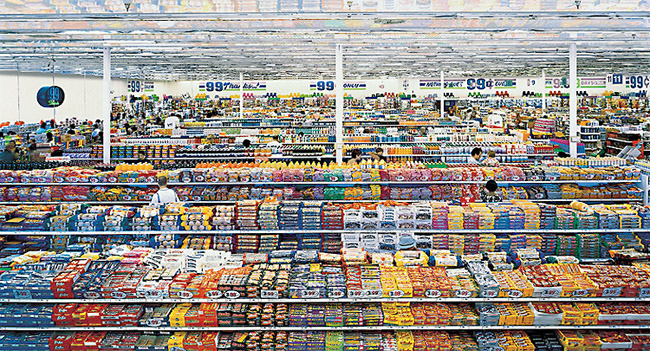
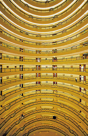
Another product of the Bechers and the Kunstakademie Dusseldorf, Gursky found his own voice and broke the fetters of his early photography when he decided to examine and portray elements of capitalism and huge land or city scapes where the anonymous individual is but one among many. His images truly represent the effect of globalisation on our contemporary lives, I guess depending on which side of the financial divide you sit on you can read them either as a criticism or a celebration of capitalism ;o) I find Edward Burtynsky's work has a more obvious critical view of the damage man is inflicting on the environment. Pursuing this idea took him all over the world to capture the Olympics, a cross-country marathon involving hundreds of skiers, trading floors of international traders and shelves of goods in a 99c store.

Andreas Gursky: 99 Cent
99 Cent. 1999 Andreas Gursky
Shanghai 2000 Andreas Gursky

Gursky's work looks amazing online and in books so the original vast prints must be very impressive.

August Sander

Sander's project Man of the Twentieth Century was to document the people of his native Westerwald, near Cologne. He believed that "...that people are formed by the light and air, by their inherited traits, and their actions. We can tell from appearance the work someone does or does not do; we can read in his face whether he is happy or troubled." During this project Sander was to photograph over six hundred German people, subjects from all walks of life creating the typological catalogue which has inspired many future generations of artists and photographers. Sander ran the gauntlet of the Nazi party, continuing to make photographs despite the subjects not conforming to their Aryan race ideals.


references

Artists [n/d] Candida Hofer [photographs] [online] Rena Bransten Gallery Website. Available from:
http://www.renabranstengallery.com/hofer.html [Accessed 29 May 2011]

Blank, G. (2007) Gil Blank and Thomas Struth in conversation [online] Originally published in Whitewall magazine, Volume 6, 2007. Gil Blank Website. Available from: http://www.gilblank.com/texts/intvws/struthintvw.html [Accessed 29 May 2011]

Burtynsky, E. [n/d]Edward Burtynsky photographic works [online]. Edward Burtynsky Website. Available from: http://www.edwardburtynsky.com/index.html [Accessed 29 May 2011]

Exhibitions (2001) Andreas Gursky images and biography [online] The Museum of Modern Art Website. Available from: http://www.moma.org/interactives/exhibitions/2001/gursky/ [Accessed 29 May 2011]

Explore Art [n/d] August Sander [online]. The J.Paul Getty Museum Website. Available from: http://www.getty.edu/art/gettyguide/artMakerDetails?maker=1786 [Accessed 29 May 2011]

Lane, G. (2009) Thomas Ruff interview [online] foto8 Website. Available from: http://www.foto8.com/new/online/blog/1014-thomas-ruff-interview [Accessed 29 May 2011]

Special Exhibitions [n/d] Thomas Struth [photographs] [online] The Metropolitan Museum of Art Website. Available from: http://www.metmuseum.org/special/Thomas_Struth/struth_images.htm [Accessed 29 May 2011]

Stimson, B. (2004) The Photographic Comportment of Bernd and Hilla Becher [online]. Tate Website. Avaiable from: http://www.tate.org.uk/research/tateresearch/tatepapers/04spring/stimson_paper.htm
[Accessed 29 May 2011]

Struth, T. [n/d] Thomas Struth - Virtual Exhibition Tour [online]. Thomas Struth Website. Available from: http://thomasstruth25.com/all/html/800_architecture.htm [Accessed 29 May 2011]

Zwirner, D. [n/d] Thomas Ruff  [photographs] [online]. David Zwirner Website. Available from:   http://www.davidzwirner.com/artists/18/available_works.htm [Accessed 29 May 2011]

Typology Homework

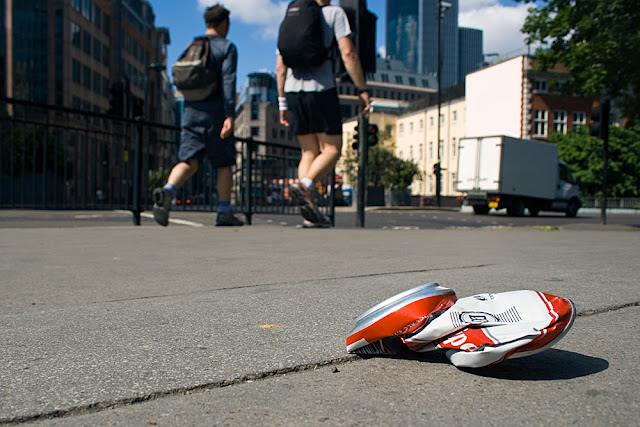
We also get set homework ;o) The first assignment was create our own series of images that illustrated the idea of a typology. After viewing Paul Graham and some of the entries for the Sony WP) Awards I thought I'd try a contemporary approach to the idea. Whilst out at the Paul Graham study day I took my camera hoping for some inspiration along the way. I had a few ideas in mind but they all seemed to be "the usual" I could do the mugs in my kitchen, flowers in the garden, different bead/cottons/craft materials or sweets.... Instead I picked up and ran with the idea of shooting things that we feel passionate about, either intense likes or dislikes. The idea of shooting rubbish was born...hence why some fellow students on the day may have seen me grovelling on the floor or arriving a little dustier than is usual for a study day!

I seem to be developing a tendency towards employing a wider angle, not sure if this will continue and be my "style" but for the subjects I am choosing and the effects I want to achieve at the moment it seems to work. Also wanting to get away from the standard "this is my subject" and it being slap bang in the middle of the frame I tried to make all the main subjects to the right, similarly lit with an overall theme of litter concerned with drinking and cigarettes appearing..... here are the results..poor in comparison to the above but hey I only had a week ;o)


References for PWDP Part 1

Adobe [2011] Adobe Photoshop CS4*Remove a color cast using Auto Color [online]. Adobe Website.Available from:

Bailey, R. [2010] Sarah After Vermeer #1[Photograph] [online]. The 2010 Project Website. Available from:  http://the2010project.com/sarah-after-vermeer-1/

Berry, I. [1960] South Africa Sharpeville [online images]. Magnum Images Website. Available from:

Berry, I. (date not specified) Biography [online]. Ian Berry Magnum Photography Website. Available from: http://www.ianberrymagnum.com/contact.php [Accessed 28 May 2011]

Cestari, F.[2011] Surfism a New Religion [Photograph] [online] Guardian Website. Available from:

Cestari, F.[2011] Surfism a New Religion [Photograph] [online] . Morfae Website. Available from:
http://www.morfae.com/0796-wpa/ [Accessed May 28 2011]

Computing Sciences (date not specified) Metamerism, [online]. University of East Anglia Website. Available from: http://www2.cmp.uea.ac.uk/Research/compvis/Metamerism/Metamerism.htm 
[Accessed 11 May 2011]

Cox, P. [2011] The Histogram Explained [online]. Peter Cox Photocourses Website. Available from:

Davidson, B.[various] Archive Images [Photographs] [online]. Magnum Website. Available from: http://www.magnumphotos.com/C.aspxVP=XSpecific_MAG.PhotographerDetail_VPage&l1=0&pid=2K7O3R14QG6O&nm=Bruce%20Davidson [Accessed 28 May 2011]

Demand, T. [2007] Embassy VII  [Photograph] [online]. ArtCritical Website . Available from:
[Accessed 28 May 2011]

Digital Photography Review, [2008-2011] Review Canon eos 400d Dynamic Range [online]. Available from: http://www.dpreview.com/reviews/canoneos400d/page19.asp [Accessed 15 May 2011]

Dunn, C. [2010] Everybody Street Interview with Bruce Davidson [online] The New Yorker Website Photo Booth Blog. Available from:
[Accessed 28 May 2011]

Franck, P [2011] 22525-61155 [Photograph] [online] Guardian Website. Available from:

Graham, P. (date not specified) Paul Graham Archive [online] Available from: http://www.paulgrahamarchive.com/index.html [Accessed 22 May 2011]

Hansen, T., Olkkonen, M., Walter, S. & Gegenfurtner, K.R. (2006) Memory modulates color appearance. Nature Neuroscience,  9, 1367-1368.[online].Cambridge Research Systems Website. Available from: http://www.crsltd.com/research-topics/colour-group/index.html [Accessed 16 May 2011]

Hunter, T. [1997] Woman Reading Possession Order [Photograph] [online].Tom Hunter Website. Available from: http://www.tomhunter.org/html/pu_01.htm [Accessed 28 May 2011]

Krishnamurti, J. (date not specified) Quotes Creativity [online]. Buddha Teachings Discourses of Buddha,Ramana,Ramakrishna, Shankara, Lao Tzu Gurdjieff Website. Available from:
http://www.messagefrommasters.com/Spiritual_Quotes/Jiddu_Krishnamurti/jiddu_krishnamurti_quotes_creativity.htm
[Accessed 8 May 2011]

LaChapelle,D. [2006] Heaven to Hell  [Photograph] [online] . Available from:
LaChapelle,D. [2003] Jesus is My Homeboy  [Photograph] [online] . Available from:
http://www.davidlachapelle.com/series/jesus-is-my-homeboy/ [Accessed 28 May 2011]

O'Hagan,S [2010] Outside in by Bruce Davidson Book Review [online]. The Observer. Avavilable from:
http://www.guardian.co.uk/books/2010/jun/13/outside-inside-bruce-davidson-review [Accessed 28 May 2011]

O'Hagan, S. [2011] The Big Picture: Whitechapel 1972 Interview [online]. The Observer. Available from: http://www.guardian.co.uk/theobserver/2011/mar/06/whitechapel-gallery-ian-berry-magnum [Accessed 28 May 2011]

Shuman, A. [2010] The Knights Move - in Conversation with Paul Graham Interview [online]. Seesaw Magazine/Seesaw Productions. Available from: http://seesawmagazine.com/paulgrahaminterview/paulgrahaminterview.html [Accessed 22 May 2011]

Sundew, S. [2010] Children of Underground [Photograph] [online] Guardian Website. Available from:
http://www.guardian.co.uk/artanddesign/gallery/2011/apr/26/sony-world-photography-awards-in-pictures#/?picture=373986527&index=8 [Accessed May 28 2011]

Whitechapel Gallery [2011] Paul Graham Further Information [online]. Whitechapel Gallery downloads. Available from: http://www.whitechapelgallery.org/downloads/Paul_Graham_further_information.doc.pdf
[Accessed 22 May 2011]

Whitechapel Gallery [2011] Graham Educational Resource [online]. Whitechapel Gallery downloads. Available from: http://www.whitechapelgallery.org/downloads/GrahamEducationResource.pdf
[Accessed 22 May 2011]

General research http://www.worldphoto.org/ [Accessed 28 May 2011]

All images taken from the PwDP CD for information and project purposes are the sole property of Open College of Arts © 2004

Summing up Section One

With this next course, PwDP, I found whilst flicking through the projects that a lot of them duplicated some of the information gleaned in DPP but in much more depth. Followers, and anyone coming across this blog randomly, will notice that I didn't complete the final Assignment 1. This is because of a slight change of tack. Having met Gareth at the Paul Graham study day it has been agreed that I can transfer to the new PwDP course that will be published soon and has a totally different approach. I am looking forward to this new course very much, excitement and tredipation as there won't be any examples to refer to, or discussions on forums to read as it is all so new.....

Looking back over the past few weeks and what I want to achieve from the course I think I am on track with "ticking boxes" as far as some of my initial targets are concerned. I've certainly had an open mind towards some artists (Paul Graham for example) been exploring other artists work (my feet certainly know they have walked miles of exhibition halls) and contributed to some discussion forums on the Flickr group and the WeAreOCA site...tho the last lot on flickr tended to be off topic about my car!

I've been keeping a list of all sources and attempted to write them up a la Harvard referencing system but it can be a tad difficult when websites don't have dates on....I've decided that I will publish a post containing all references used at the end of each section as there are quite a few, and leaving to the very end would mean a HUGE list that wouldn't be easy to cross reference.

I've a few more "catching up" posts to make with regards to a short Art Photography course I have signed up for and then I'll have more about my new Assignment One......

Saturday 28 May 2011

Bruce Davidson Retrospective Somerset House 2011

Another photographer whose work I was more familiar with but couldn't put a name to the images. Wandering round the exhibition rooms I was delighted by the photographs which were sympathetically produced no matter what the subject. An American photographer born in 1933 he joined Magnum in 1956 becoming a full member in 1959. Famous early series are The Dwarf and Brooklyn Gang. Between 1961 and 1965 Davidson chronicled the American Civil Rights movement, for which he received a Guggenheim Fellowship in 1962 to support the project.

The exhibition at Somerset house, being a retrospective look at his social documentary work, featured images from across the board, The Dwarf, The Brooklyn Gang, Freedom Rides, Central Park and East 100th Street. Bruce Davidson won the Sony World Photography Outstanding Contribution to Photography Award 2011.Bruce Davidson - Outstanding Contribition to Photography - World Photography Organisation

The simple yet effective way in which he captured the huge tenement buildings in New York's East Harlem and the occupants is very evocative. Apparently some contemporary critics have accused Davidson of exploitation but how can photographs of children peering though cracked, grubby windows be considered exploitative yet Jim Golberg's Polaroids of human trafficking not? Davidson was at least exploring the suffering and misery on his own doorstep rather than seemingly pointing a finger of blame at third world countries unable to solve their problems. Or is that me being overly political ;o) Davidson is quoted as saying

"I view my work as a series, I often find myself as an outsider on the inside, discovering beauty and meaning in the most desperate of situations." 

Having just finished reading "Roll of Thunder Hear by Cry" by Mildred D Taylor I could really empathise with the Civil Rights Movement set. His images of the One-room School House in Selma Alabama 1965 and Annie Blackman in her sharecropper cabin holding her youngest child, Felicia. Selma, Alabama, 1965, could have been taken to illustrate the book although taken 30 years after the time period in which it was set, they show nothing changed for a long time.

Just my opinion but a brilliant photographer :oP

interesting video short : o)

Photo Booth: Video: Bruce Davidson on Street Photography : The New Yorker

Longer one..In the Photographer's Lounge: Bruce Davidson in conversation with Simon Baker

I think I'd quite like to own his book Bruce Davidson: Outside / Inside: Journey of Consciousness but at £158.00 I don't think I shall :o/ Anyone feeling generous?

Sony World Photography Awards 2011

We definitely photographed ourselves out last Saturday moving onto Somerset House where the Sony World Photography Awards exhibition was being staged along with a Bruce Davidson retrospective.

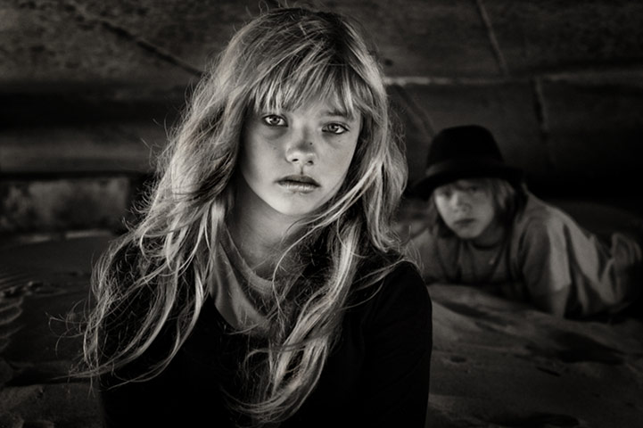
There were so many categories and images at the Sony exhibition I think they all blurred together and I can't really make any coherent statement about anyone particular artist or genre. As expected I loved some, and happily walked away from others. Certain images or sets stuck in my mind and not always because they were my favourites but because they reminded me of the work of others due to ideas/style/approach. For example the Children of Underground Gundrega Sundew, reminded me of the shot Candy Cigarette taken by Sally Mann.


Sony awards 2011: Sony awards 2011
Children of Underground, Gundrega Sundew, Latvia (2010)

Mann1992_10.jpg
Candy Cigarette, 1989 Sally Mann
Peter Franck with his photographs mixed with painting was so reminiscent of Thomas Demand.....


Sony awards 2011: Sony awards 2011
22525-61155, Peter Franck, Germany (2011)
Embassy by Thomas Demand
Embassy Thomas Demand
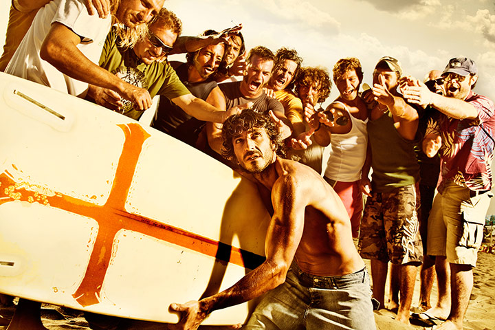
Fabrizio Cestari had hints of David LaChapelle with his surfism series......

Sony awards 2011: Sony awards 2011
Surfism – a New Religion, Fabrizio Cestari, Italy (2011)
SURFISM-A NEW RELIGION
Surfism – a New Religion, Fabrizio Cestari, Italy (2011)


Pieta with Courtney Love
Heaven to Hell 2006 David LaChapelle

Last Supper
Jesus is My Homeboy 2003 Davis LaChapelle
Richard Bailey did a series Sarah after Vermeer ....


Sarah After Vermeer#1 2010 Richard Bailey
 A style which has been copied by many artists since the original but the one which stuck in my mind was Tom Hunter, as I recently looked at some of his series, with this one from Persons Unknown.


Next
Woman Reading Eviction Notice 1997 Tom Hunter
Finally the remake of the iconic Robert Doisneau image Le Baiser de l'Hotel de Ville, Paris, 1950.

Quite sad that to think with all the original work that was about it was the similarities that I remember. Had the exhibition been on longer I may have been tempted to go back another day to help fix the other information in my mind. Instead I shall have a good browse of the World Photography Organisation website instead...
World Photography Organisation

I took away quite a bit from this exhibition (apart from aching feet) including that new work can rub shoulders along side reworkings of old ideas but am finding it hard to think of what else it was now putting fingers to keyboard ;o) Unless it was more of the same from the other two we did...its all merging........

Entires in my learning log about this exhibition

Ian Berry This is Whitechapel Whitechapel Gallery May 2011

So much catching up to do and only a week has past! Totally non-photographic but my car got written off, accident on the 9th, had to wait two weeks for the decision from the insurers :o/ So the past week has been based around talking cars, thinking cars, looking at cars....still need to do all of those but at least I know now how much they are going to give me in return for some very bent metal :o( and I can attempt to put thinking head back on....

Whilst at the Paul Graham exhibition we also had the opportunity to view some of the work of  Ian Berry, his body of titled This is Whitechapel. I have to be honest and admit that I had never heard of Ian Berry prior to signing up for this event, so it is another photographer I can add to the ever growing list of new works to explore and artists to discover.

An award winning photographer,born in Lancashire, Berry made a name for himself in South Africa whilst working for the Daily Mail and later Drum magazine. His images are a cross between photojournalism and social documentary, his photographs of the Sharpville massacre in 1960 were tremendously important, not only to show the world was was occurring but they were later used as evidence to support innocent victims during their subsequent trials. Invited to join Magnum in 1962 Berry continues to cover social and political change across the world.

So lots to look at for future reference ;o) but for now I'm just going to comment on the exhibition at the Whitechapel Gallery which runs until 4 September 2011.

This is Whitechapel

The display of Berry's work is in a small room which also contains a short video and other archive documentation from the period of this commission, all of which help make the exhibition feel even more familiar and intimate, bringing to life what the area must have felt like back in 1972.

Or maybe that is as with the earlier Paul Graham work I could recognise/empathise with quite so much of the imagery? Having shopped in Petticoat Lane and with family born and bred if not exactly in the East End but not far away, it was like looking through a family album in places.This set of images also seemed to cross genres of social documentary/street. So many blurred lines ;o) In the 1970's London's East End was undergoing rapid social and economic change. For some reason this part of London does alter tremendously, the poorer East End British population replaced by the Jewish community, the then established Jewish community subsequently moving away to be replaced by the south Asian population. The Whitechapel Gallery commissioned Berry to document this transition.

Some people looking at these images now criticise them for containing stereotypes, what they fail to realise that these people were what was to be found in the area at that time and history/the media has made them into stereotypes. What I loved about this exhibition was that in just a few shots Berry really captured the feel and the characters of the area, although only a small section of the whole body of work is actually on display. Shooting in black and white and with what I presume is a slightly wide angle lens the whole gamut of society, age, race, social standing, characters and emotions are brilliantly summed up. Although like with Graham, he was photographing what could be termed the mundane and everyday, I found these images more compelling as they seemed to say more to me about the character of the people and place than did A Shimmer of Possibility.

Even though these photographs were taken nearly forty years ago I found it amusing to spot some similarities with the world today, from drunks passed out in a park to people with pets tucked under their arms ;o) Surprisingly Berry took just two weeks to complete this commission; to weeks in which he manages to accurately reflect life in its many aspects.

With my "referencing" head on I spotted similarites with the painted clown in one of his shots to the work of Bruce Davidson's "The Dwarf" and on researching Berry a little more on discovering "The English" wonder how much of his work influenced Simon Roberts for his series "We English" which I am a little more familiar with....

Interestingly I found an interview online reported in the Observer, in which he talks about shooting in the streets at that time. Berry unbelievably recollects,

"It was a different time and people were still not used to the notion of street photography. I just walked into schools with my camera, which you could certainly not do now. At the local hospital, they gave me a white coat, told me not to get in the way of the doctors, and just left me to get on with it. You had a freedom then that photographers no longer have."

He also comments on one of this images, one where two West Indian women are crossing the street,

"It's not my favourite photograph and it did not make it into the original show......the ladies make a great shape but it just misses being great because of that white car. Had I printed it myself, which I didn't have time to, I would have darkened that bloody car."

I love reading interviews where photographers share thoughts like this, makes more sense to know what they liked or didn't like, how they would alter their images, wish they had had more control over the final production, more insightful than "marketing" spiel..... This is a great exhibition (well I thought so anyway) and does not need to join the "Olympics 2012" hype to attract an audience.

If you have the time I would recommend you visit the Whitechapel Gallery and take in the work of two very interesting photographers. Researching the back stories can be just as rewarding and possibly even more helpful. I have learnt so much from both exhibitions, you can alter your genres or at least make them cross over, you can continually re-invent yourself to keep fresh, it is important to revisit your work to see what can be improved upon, and that control of production can be just as important as pressing the button. Once you have captured the frame that is just the beginning not the end of creating a photograph.

Sunday 22 May 2011

Paul Graham Exhibition Whitechapel Gallery 2011

OCA study day and my second. It was really great to meet up with people, ones I had seen before, some new and Gareth as the official "face" of the OCA. There is so much to write up about this day, hopefully I can put things down in an orderly fashion.

Starting with the beginning and the end of the day rolled together; my reasons for going. A question I put to myself when adding my name to the list then posed by Gareth at the end of the day. The reasons were many-fold: to meet fellow students, to talk to whoever it is on the day representing the OCA, a day trip out ;o), taking in an exhibition, learning whatever there is to be learnt from said exhibition and the main one to have an overview of the works of Paul Graham.

I know I have failings and one of them is being overly cynical and a tendency to not be as open minded as I should be. In order to overcome this I throw down the gauntlet to myself and say "you WILL give it a chance", this sadly included Paul Graham. My only experience of him had been a viewing, back in 2009, of his series "A Shimmer of Possibility" and seeing his interview on WeAreOCA hmmmmmmm "Monkey's Wedding" ....whilst agreeing with Gareth that his take on good art is a great definition “it’s about many things, it’s not just about one idea or one concept – it’s open, it’s about many different things and it’s often about more than the artist intended” I do think he occasionally oversteps the mark with his artistic statements, originally taking a shot (one I nicknamed  LawnMower Man) because he was interested in the man and his US flag T shirt more than the landscape, he hears a noise, grabs his camera and starts shooting, he then reads more into it about Greek mythology, and the beauty of life, is it about racism, about the flow of life...? Thats what he reads into it after...that wasn't his initial intention. That is what annoys me sometimes about curators telling us what the intentions were...you know occasionally there isn't one, but we can all make one fit after the event. Anyway that was where I was coming from, I had decided I didn't much take a fancy to his work but based solely on one series...

Then this "retrospective" exhibition was advertised, or as working artists like to say "a mid-career survey" so in the spirit of being open-minded and willing to learn I signed up.

The exhibition itself covers bodies of work from 1981-2006 and show how Paul Graham has changed his style, subject matter and prefers to not re-visit what he has already done. Paul Graham prints all his own work and it was interesting to discover that apart from the A1 series, which are vintage prints, everything else was reprinted for this retrospective tour. It is divided into 3 sections, the earliest covering the British colour work, the second concerning itself with his travels, and the third ending up with the images he likes to think explores how the medium of photography can be used more than images with a political commentary.Unlike the exhibition, which starts with Television Portraits, I'm going to discuss each series chronologically.

A1: The Great West Road

I liked this series, probably due to the fact I could identify with it and on so many levels. It didn't matter to me that it was of historical importance, being controversially one of the first significant works produced in colour in the UK. I could see the influences of other artists in particular William Eggleston and Stephen Shore (makes me smile when I can reference other's work and not just say it because it was something I saw on a website) It charts a road trip along the A1 during 1981-82. I enjoyed spotting things from my own cultural background, Little Chefs, people in aprons, smoking in places where it would now be banned, the fashions of the day, the style of the cars, the areas I have driven through and noting how they have altered. I think looking at his work retrospectively you can start to see his preference for bold vivid colours, red and blues seem prominent in a lot of his work. All these images were taken with a large format camera, are printed in the same style, size, relatively small 8x10, and the minute details don't seem to have as much significance as the main subject. I can see why this was considered as his breakthrough into photography and is held in such regard.

Beyond Caring

With images taken in 1984-1985 this was another series I could heavily identify with. Although never having been unemployed or having faced a "dole queue" I started work in 1980 and remember only too well the economic state at that time. The charts were full of protest songs, riots had occurred across the nation a few years back, and by 1984 unemployment was still rising... These photographs bring it all back, not sure if people from other "eras" or cultures would get the point as much, but that is one of the joys of photography, it can mean different things to different people. The images are printed on a larger scale, but still the same size, the angles are off due to the surreptitious nature of the capture, but I think this only adds to the uncomfortable surroundings, and the way that people must have felt out of kilter with the world.

Small details creep in, again spotting people smoking in an office, the discarded litter on the floor, maybe intentionally echoing the way the unemployed felt discarded (or am I doing my own version of let's make it up :oP) toddlers and babies buggies add to the throng showing women were affected as much as men, the adults and children alike holding their chins in their hands with bland emotionless expressions. Two images stand out in my mind especially, the one with the toddler in pink, a subtle contrast against the drab blues of the waiting men, the repeat pattern of walking sticks and me making up my own stories once more, is the toddler wondering "is this MY future?" That could have crossed Graham's mind or it could be he just pushed the button... and the other which made me smile was the image of a man reading a newspaper while the Victorian gentleman of the wall decoration seemed to peer over his shoulder doing the same. All in all quite depressing, you can't fail to read the message, feel the despondency, the images have a definite political overtone and tell the story of overcrowded unemployment offices of the period.

Troubled Land 

Taken in 1985-86 this set crosses two genres, that of landscape and reportage.Yet another series I appreciated and identified with. Working in London I faced the disruption of bomb scares, and problems when actual incidents took place. Even though it had happened 10 years early, the assassination of Ross McWhirter by PIRA in 1975 had shocked me as a child (although McWhirter did have some ideas that I don't agree with) as had the murder of Lord Mountbatten. The "troubles" were something that were always there even if I didn't quite understand the history behind it then.

These images show quite a shift in Graham's work. They are printed in a large format and need to be for the smaller details to be fully visible and the context of hidden clues within the photograph to be seen. On the face of it each image is an impressive landscape shot, be it of sweeping fields or sprawling towns, however the closer you look the more you see; the painted kerb stones, the political flags and posters, the Union Flag in a tree and you realise you are looking at a landscape where every corner has an allegiance; it mattered, and it was dangerous. The photograph of the soldiers running across the roundabout was the most interesting to me for a few reasons. It appeared to be an everyday place, but apparently five minutes down the road in the direction the soldiers were running is the Falls Road. A name which was mentioned all the time on the news, it appears an everyday scene but then you notice it IS soldiers running, something you don't see everyday where I live. More political posters, graffiti on walls and railings saying "IRA", "PIRA", "SMASH THE H BLOCK" I dare say my daughter wouldn't even know what the H block was... how times change.

The main interest I had in this image was what I had been told about it. A friend of mine is a professional photographer sponsored by Sony, he attended the press opening of this exhibition and was lucky enough to speak to Graham about his images and ways of working. Apparently this image had been his "hook" his "way into" this set. Graham had been taking photographs of Ireland for a while but was not satisfied as most of what he was taking just resembled everyone else's; all armoured cars rumbling through streets etc. Then he took the roundabout shot, he realised he could expand the idea, look into that which was hidden. From then on his images were wide sweeping landscapes of Ireland with subtle clues, the helicopter in the sky, paint on the road from making banners, the "Republican Parade"...although there is now a question mark in my mind about this image. Labelled as "Republican Parade" it was pointed out to me that the flag on the flag pole was the Loyalist Banner, with another on a nearby chimney, and the bollards in the street were painted red, white and blue...so a Republican Parade happening there is fairly dubious...surprised no-one has pointed that out before....Subsequently this idea of hidden meanings does seem to appear in quite a few of his later bodies of work.

Again I can see why this body of work was considered to be exception at the time. Graham likes to publish his works in books making photography democratic, but with some images size does matter. There are many debates on the OCA forums about image size and how they should be presented and I think that seeing this exhibition has shown that what appears to be a trite reply of "it depends on your image" really is a truism.

Ok, so I'll not be strictly chronological but because it covers the same country...

Ceasefire

Series shot in 1994 hmmmmmmmmm yes this is where a hmmmmm comes in. Clouds.....large squares of dark clouds. I mused a cloud by any other name will rain as wet ;o) We are informed that these images, taken during a tentative halt in the troubles, were of the skies over flash points in Bogside,Newry,Omagh and Shankill... and a back story is you have to "trust" that this is what they are of and trust forms part of a ceasefire. That taken, I think more than anything they show if you have made a name in photography you can shoot anything and it will get hung in a gallery.... Reading the images "my way" and writing my own theories it could be that the land is fought over, but the air is free and everyone has a right to it, and can see it, what ever side of the fence they are on, also that the ceasefire was in effect but dark skies could still be ahead.....or it could even be that the weather so bad nothing else was working, in frustration Graham snapped at the sky and then thought.......ohhhhhhhhhhhhhhhh I could...........

New Europe

For me New Europe,1988-1996, jumped about too much, there wasn't much coherence? But that could be due to the fact we were only given snapshots from the series.Strong reds and blues shone out but we had spit on Franco's grave, a one armed man in a gay cruising area, commercial looking "heroine chic" seedy portraits of drug users and prostitutes... I couldn't really identify with them so maybe that's why I couldn't empathise with the characters or understand the message? Short and to the point, shall we move on? I did...

Empty Heaven

Graham then turned his attention to Japan,1989-1995, and according to the "blurb" ideas of denial and concealment. I hadn't read any of the artist statements or the press release prior to viewing this work and I'm glad, as it meant that my initial gut reactions were honest with no pre-conceived ideas of what I was supposed to be reading into the photographs. This series left me cold. Graham also was exploring the idea of diptych and triptych presentation, but this still didn't explain to me why he had hung some images together. I couldn't see how certain images were supposed to gel. I could see why and how they were representative of Japanese culture, the young girl with Geisha like make up, her hand gesture of covering her mouth, the sweet wrapper with manga like drawings that always have huge western eyes, the symbolism of the Hiroshima bomb, the wrapped tree...I have tried but can't find out anywhere why they wrap trees but it does echo the constraints of Japanese traditions and how people are bound to them still, and it really reminded me of Araki and his bondage shots...I fear this series had me being very irreverent and joking that the kitten calendar wasn't taken in Japan at all, but in his kitchen back home in Margate (or Skeggie) and the portrait of the man stopped where it did because in reality from the neck down he was naked and bound......I may not have appreciated this series but it was a talking point and entertained us, which one could argue is the point of good photography and once an artist lets his creation out into the world he no longer controls how people view it....

 End of an Age

This is a long post, possibly overload time but as I said at the start, this exhibition has raised many questions and made me me think a lot about different approaches and what I enjoy or "get". As a set of images I don't really like End of an Era. The theme is twenty somethings in nightclubs doing what 20 somethings do, drinking, smoking, observing. In 1996-2006 Graham is the observer watching a rite of passage into adulthood from innocence into experience. Although I can identify with the theme of this set, having been young once, the images to me don't challenge the concept of portraiture, maybe the establishment view of portraiture but haven't we all taken shots like these growing up, just didn't put them in a gallery? I can see that he was looking at what the camera can achieve, deliberately breaking rules about using what he describes as "dumb direct flash", not correcting colour cast, having a mix of sharp and fuzzy images, not having his subjects facing the camera.  So this was his take on it, the oddities of camera shake, challenging the establishment (or as I like to think blinkered camera club ideals of perfect chocolate box imagery) nothing to do with the subjects possible delving into drugs and seeing the world through an alcoholic haze....so why do exhibition tour guides try and sell you that idea? However one or two of the photographs, especially the soft focus images with colour casts I did think were effective so it wasn't all bad ;o)

When questioned about this set he replied "you’re not supposed to fail to focus the picture and have camera blur, or leave the colour-staining from the nightclub lights – you’re supposed to correct that out. But... you know – whatever it takes to make the pictures reach people."
American Night

American Night once more explores rule breaking and brings back the "hidden" concept. Between1998 to 2002 Graham was taking photographs in America. Apparently for his first few trips he did not take his camera for fear of doing nothing but replicate the work of his earlier influences. His experimentation with photography in conceptual and technical ways is very apparent in this set. He found his "gateway" into this series by accident, overexposing his shot but the more he looked at it the more he found it interesting. Graham thought of the "approved" ways of depicting poverty, dark and gloomy and chose instead to depict the rundown streets in this over-exposed fashion, literally hiding the more unacceptable face of poverty and placing it under a "whitewash." The shots were produced by deliberately overexposing them in camera and Graham was able to maintain that during developing as he did all his own processing. The final high key images are placed alongside the more anodyne acceptable version of the American dream, a detached house in vibrant colours, showing the disparity between rich and poor even more so, although beautifully understated there is also a hint of the racism that still pervades American society. This bright image sit jarringly between the ghost like frames but it works. This set grew on me the more I looked at it although I found the overexposed images more interesting as you really had to look hard to see what information they held. Photographs tell a story, some you can see the plot immediately others you have to read harder and concentrate more.

Shimmer of  Possibility

So we come to A Shimmer of Possibility 2004-2006, which turned me off him so much. I have to admit I have mellowed towards them slightly, but only slightly.I can see where he is coming from with them, they tell a story, he follows people down a street or watches a person from afar noting their actions, he does not stage his work but accepts what is there and captures the mundane and ordinary. Seeing what they see as life passes them by or they pass life by. His framing and presentation makes them into separate stories where you pause before moving onto the next. I get the idea, but I don't profess to enjoy the images, his artistic statements have become so full of allegory and as someone on a blog I recently found wrote  Shimmer "feels like it is collapsing under the weight of its own artistic pretensions..." Possibly due to the American slant I can't identify with them even though they are doing ordinary things such as smoking or buying Pepsi? Maybe they are too ordinary and the super hype surrounding them puts me off ? I do like the short story ideas though but think the stories he is telling leaves me going yes and.....?

Television Portraits

I forgot these.......people watching TV....no more no less...all ages, sexes, concentrating on the TV while PG snapped them...what more can you say.....

General information.....

When questioned over how he appears to not go with the flow, using colour when others used black and white, using medium format when others then turned to large, Graham replied it was "more to keeping the medium alive rather than a reaction against what everyone else is doing."

He was approached to do a similar project to Troubled Land in Israel or Central America but declined considering it "like a creative death."

Questioned about planning work or setting out with a specific image in mind Graham stated "Any sentient photographer has some idea of what they’re hoping to find, but you have to be open to what the world throws back at you, and engage with how it challenges and transforms your idea." Which ties in with Clive's phraseology of "finger tip searches" until you find what works.

Paul Graham swapped to using digital about 5 years ago.

In conclusion I am glad I went, the day gave me all I wanted and more, I met people,I talked, I contemplated, I took in the work, I was open minded and found that actually I couldn't in truth say "I don't like Paul Graham" I just don't get all of his work, it was great to admit I was wrong (don't faint) and say to Gareth that just because I didn't embrace the whole shooting match didn't mean I couldn't appreciate that he had something important to say,when talking straight I find him really interesting and he makes extremely valid points. I just don't think his later photography makes those points as clearly, and artistic statements that accompany so much Art Photography poke at the cynic in me. As the man himself said "I guess that, like any other contemporary art, certain people pick up on what I do, and others don’t."

Another of my aims for attending this exhibition and future events is to help me find my voice, not only when taking photographs but also when discussing them. I want to be able to comment without parroting press releases and other reviewers,to build my own "catalogue" of references, express my own opinions based upon knowledge gradually gathered through looking and reading. Just as Paul Graham looks at his images and spots a way in maybe Paul Graham will be my "gateway" into finding that voice?


http://seesawmagazine.com/paulgrahaminterview/paulgrahaminterview.html
http://www.whitechapelgallery.org/downloads/Paul_Graham_further_information.doc.pdf
http://www.whitechapelgallery.org/downloads/GrahamEducationResource.pdf
http://www.paulgrahamarchive.com/


Learning Log entires with jotted notes


Assignment 1: seasonal colour changes

Not quite sure of some things possibly in the pipeline so am halting progression on this assignment until I get confirmation of a possible change of direction...but as I hate unfinished elements in my life am going to play with at least one image to prove to myself I was going to have fun with this part....

I decided to really throw down the gauntlet and pick an image which had spring written all over it and had lots of foliage...I mean how can you make a tree full of leaves look like winter? So here is how it went after a first attempt...


Spring
 This was the original spring shot taken a few weeks back. Bright green leaves and lots of blue bluebells.


Summer
 Here I did some alterations using various adjustment layers and making minor tweaks to local selected areas. The greens were darkened as leaves naturally become darker in the summer and the colour of the flowers were changed to a shade resembling foxgloves which can be found in the woods in summer months. Contrast was also increased as the sunlight would be brighter and stronger at the same time of day.

Autumn
Changing hue/satuaration for the trees to autumnal colours wasn't too difficult and once more employing different layers I tried to make them have differing shades. The trickiest bart on this one was the blubells, I couldnt get them to have a decent looking "dead brownish"  look at all. intermingled as they are with the grass was hard..went for a frosty look instead but am not convinced.....I may have another shot but seeing as it isn't probably going to be submitted I don't know if I will, other than for personal satisfaction? Also experimented with adding a slight autumnal mist, never done it before and quite pleased with how it has turned out...shame the bluebells underneath look naff ;o)

Winter
Last but not least cold winter feel.....trying to give a cold frosty, sprinkling of snow effect, not turned out too bad, if I was going to pick on anything would be the leaf at the front...guess I could see if I could clone it out....
To compare...

On the whole quite pleased with the initial playing about, may go back and do the little tweakiy bits....but who knows...

Friday 20 May 2011

Project 8: altering colour with hue/saturation

to be completed...or not as the case maybe....? Am waiting for the post to arrive next week and to chat to Joe...

Thursday 19 May 2011

Project 7: altering colours with levels

For the first part of this project I had to use Levels to change a colour precisely, opening the OCA colour chart I then used the middle sliders to change the values of the Red Channel then the Blue Channel to match the value of the Green. This was quite tricky to do as I couldn't find a way to have both the Levels information panel and the colour picker palette info panel open at the same time. Adjusting the slider bit by bit I eventually got as close as I could. The first adjustment made the orange square green with the second adjustment achieving the as close as possible neutral grey.


OCA Colour Chart orange square altered to neutral grey in 2 steps


Values

Orange Square

Green Square

Grey Square
H
30°
60°
240°
S
69%
53%
1%
B
91%
59%
59%
R
231
150
150
G
150
150
150
B
71
71
151


Obviously this task has shown that it is possibly to adjust colours to neutral and remove a slight colour cast. Hopefully any photograph taken would not have a cast as great that you would cause such an exaggerated shift as above. As demonstrated when you alter for the neutral all other colours will also shift.

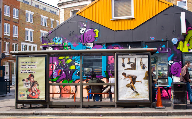
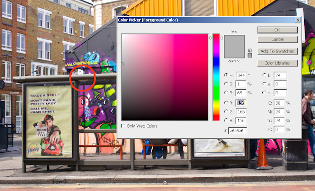
The second part of this project entailed choosing an image which contained a colour that I thought should be neutral. I chose an image of a bus shelter taken near Brick Lane in London.

Brick Lane
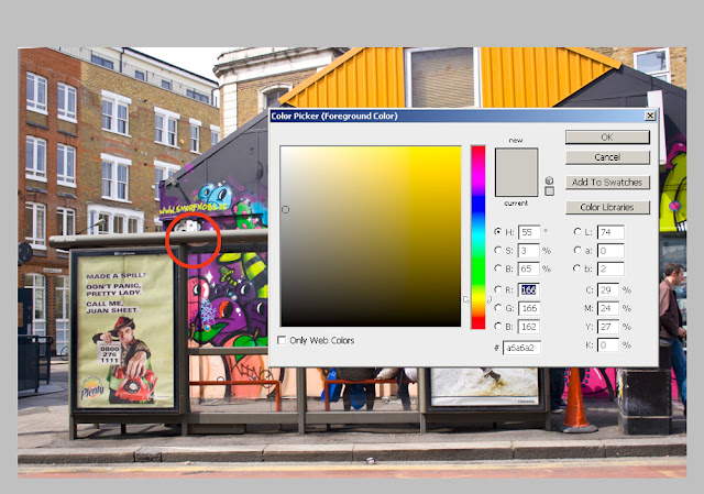
I took a sample of the bus shelter and was pleased to see the readings were almost spot on the RGB values being 166,166,162!


Neutral sample before adjusting

I then used Levels adjustment layers to increase the Blue channel. It took four very small increments to reach the correct Blue value of 166 and the saturation to read 1%. A fiddly task but worth it learning/understanding and refining to rescue any other image that otherwise might have been discarded.

Neutral sample after adjustment
This may not have been a brilliant choice of image in some respects as the adjustment was minor, with no strong cast I did not have to overly worry about the other colours shifting too far, having said that if there is a strong cast to an image the colours would need to shift that far to register correctly. It has shown that my judgment of white balance on the day of shooting was good and that my judgement of what should be a neutral colour has improved since DPP.