 |
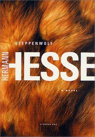
| Steppenwolf Hermann Hess (publisher Picador 2002) designer Henry Sene Yee |

Steppenwolf is the story of a man exploring his own nature, elements of his personality one high, the spiritual nature of man; while the other is low, animalistic; a "wolf of the steppes". This can be a problem with images which are very simple. I originally had no idea what the book was about and on looking at the cover, and the previous ones I assumed it to be about a werewolf!
 |
| Jane Eyre Charlotte Bronte (publisher Vintage 2009) designer Megan Wilson |
Another book which has had many designs, the earliest here in the middle (now out of print) is a 1943 edition published by Random. The one on the end is the 2007 version of a Vintage publication. Penguin Classics also has many versions of the same book.

All these book covers lend themselves to the story of Jane Eyre. This could be because I have read the book and seen several films/televised versions. The simple example informs the reader the book is about a young lady and the inclination of her head alludes to her personality.
 |
| Beowulf translated by Seamus Heaney (publisher WW Norton 1999) |

For me this was the least successful of the covers. Beowulf is an epic Anglo-Saxon poem, set in Scandinavia and written between the early 8th and early 11th century. The only manuscript was damaged by fire in 1731 and fell into obscurity before being reprinted in 1815 by an Icelandic scholar.
As no-one really reads Anglo-Saxon all versions are translations of the original poem, some are prose, others in poetic form. Seamus Heaney has been congratulated many times over for his most recent translation as he has preserved the feel of the original, retains many historical elements and portrays Beowulf as human rather than a caricature.
Although undeniably a hero, which the chain mail represents( and chain mail is mentioned in the poem), the poem constantly alludes to Beowulf's helmet. As the book is said to be a very accurate translation it is a shame the chain mail suggests more the medieval period and is very clean and shiny, not how I, at least, consider Beowulf. However this is a very subjective view and others may not agree.
Not directed to compare previous editions of the same book I found it fascinating to see the different approaches taken and to see what my preference was with the example encountered. Some are obvious illustrations rather than photographs but was an interesting exercise nonetheless. Simple conceptual ideas can be successful but the wrong choice of image could give the reader the incorrect impression of the book.
No comments:
Post a Comment