A book jacket plays a rhetorical role and serves an artistic purpose. Covers are designed to attract attention and generate immediate interest, ultimately to sell the book. The cover visuals provide clues about the book's contents, creating a first impression designed to support the book.
Exercise: Conceptual cover design
Out of the six titles, I had to get hold of as many as possible, familiarise myself with the contents and make notes on each of the cover designs accessed. I thought I'd also look at some of the other titles mentioned in this section. Not as easy at it seems :o/ On a trip to my local library do you know how many they had? None! Some of the titles are not even stocked by Bexley Council libraries. Out of the two titles they did have, The Opposite House and Presence were luckily at the main library. Trip out the next day proved to be just as fruitless, Presence, although listed as being held was missing from the shelf and The Opposite House was not the edition I needed to examine.
Plan B was a quick pop into WH Smith a few 100 yards along, unfortunately Smith's isn't a book shop which stocks a huge selection of titles and I drew a blank there as well. Plan C was a drive into Bluewater and a visit to Waterstones. Yet again they had none of the titles on their shelves. On asking at customer services 3 of the titles did not show on their system, the others they could order in but only if I wanted to buy them, not just look at them....not really wanting to spend that amount of money on six books researched them using a different tack. Plan D was to ask my mother if Croydon Libraries had them, they too only had The Opposite House and Presence. To familiarise myself with the books contents I looked for book reviews on each, and information on the designers. Some designers, for example Henry Sene Yee, have websites which give details of their design processes.
http://henryseneyee.blogspot.com/
A interview with John Gall also highlighted important factors to consider
http://turnstylenews.com/2011/06/15/john-gall-on-book-cover-design-clarity-of-communication/
and a video snippet was also enlightening
http://media.barnesandnoble.com/?fr_story=7db6b96ab6a251fe4e0ba1f0d1994613abcd86a0
basically READ THE BOOK!
Missing Men
author: Joyce Johnson
Publisher: Penguin (Non-Classics)
Publication date: July 5, 2005
Genre: Biographies and Memories
designer: Joe Montgomery
photographer: Nonstock
photographer: Andre Thijssen
Typefaces: Trade Gothic/Century
 |
| Missing Men Joyce Johnson (publisher Penguin 2005) designer Joe Montgomery |
Missing Men is Johnson’s second memoir, documenting her childhood, her mother’s story, and her life after Kerouac; a man with whom she had a two year relationship. Her life shaped by male absence: she has been widowed, her grandfather committed suicide, the death of her first and her second marriage ended in divorce.
Being biographical the image chosen followed previous research in respect that it is a clear, not obviously manipulated, photograph. In this instance a crumpled unmade bed. Due to the second bed, just out of the frame, the cover resembles an open book. This suggests Johnson is making her life story an open book, there for all to discover.
There are several devices on this cover, designed by Joe Montgomery, which outline absences,’ firstly the ‘i’ is absent from the word in the title. The crumpled sheet alludes to a missing partner and cleverly the crease replaces the missing letter. Because of this I suspect this is not a stock image and time was taken to obtain props, create the crease and shoot the scene.
The yellow sheet is a perfect foil for the simple black text, the designer choosing to use two typefaces, Trade Gothic and Century. Unable to get hold of the book I can’t comment on if the photograph extends to the back.
It is clear that the designer was aware of the subject matter, as the conceptual ideas relate to the theme and had the placement of the text in mind before the scene was shot. Without obviously depicting figures in the distance, or out of focus portraits Montgomery
The Honeymoon's Over
 |
| The Honeymoon's Over eds.Andrea Chapin and Sally Wofford-Girand (publisher Grand Central Publishing 2007) |
This book is a collection of true stories, written by women on the break up of their various relationships. True life stories tend to use photography and sometimes still life to depict elements within the book. Being a collection of 22 essays the designer has chosen one specific image to try and incorporate the general theme. Not being able to read any of these stories I cannot comment if one of them actually revolved around having burnt the toast! It could be that one of the women was in an abusive relationship and her husband would complain about his breakfast, who knows....
The ideas that spring to mind are a play on the title and the well used phase 'the honeymoon is over' suggested that the good part is ended and things go downhill from here, or have been spoilt. Another phase 'burnt toast' usually applies to celebrities who are now 'has beens' and on this occasion could referring to partners no longer the flavour of the month. The fact it is really burnt could be alluding to the dark side of relationships or the bread has been spoilt, it can't be retrieved so you throw it away? I found this quite hard to pin down, it could allude to a few themes, which in some way could be considered a good thing as it the image could mean many things to many people, therefore reach a wide audience.
The dark image provides a background for the lighter lettering and stands out against the white background. Probably a stock image.
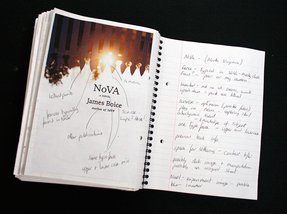
NoVa
author: James Boice
Publisher: Scribner
Publication date: December 30, 2008
Genre: Fiction
Design info:
designer: Paul Sahre
art_director: John Fulbrook III
Typeface: Prensa
 |
| Nova James Boice (publisher Scribner 2008) designer Paul Sahre |
NoVa is an acronym for Northern Virginia where this story is set. It opens with the suicide of a teenager called Grayson Donald; the book investigates the effect his death has on his friends and neighbours, examining contemporary America and the gradual falling apart of modern society.
Being fiction the imagery is more experimental; an inverted photograph of a picket fence. Not able to get hold of the book I can’t quite tell if the image is slightly fuzzy for effect or if it is the poor resolution of the online images. If deliberate it could be a device intimating that not everything in life is clear.
The fence represents the traditional picket fence you find in Virginia (virginia-white-picket-fence), setting the location and alludes to ‘manicured’ America
The sun could either be sunset indicating the end of the day/allegory of society as we currently know it coming to an end, or sunrise. The lightness of the sky implies that it is more likely to be sunrise, indicating the optimism of the human race that all will turn out ok in the end, burying their heads in the sand. The sunburst is a clever play on the title NoVa and the scientific definition of nova, being a cataclysmic event. The white sky provides space for the type, typeface Prensa.
The designer Paul Sahre would have had knowledge of the story and completed research into the meaning of the word nova and what scenery/subjects would be represent Virginia
The Opposite House
The Opposite House
author: Helen Oyeyemi
Publisher: Anchor
Publication date: June 10, 2008
Genre: Fiction
Design info:
designer: Rodrigo Corral
photographer: Robert Polidori
Typeface: Copperplate
 |
| The Opposite House Helen Oyeyemi (publisher Anchor 2008) designer Rodrigo Corral |
A novel, the photography is again slightly more experimental and inverted. This immediately suggested a world that is not as it seems, a character unsettled with where they are or in a situation they are not comfortable with.
The Opposite House introduces us to Maja, a 25-year-old singer whose black Cuban family migrated to London when she was seven. From what I can gather the book also intertwines with a viewpoint of a goddess who lives in 'somewherehouse' from which she can access both London and Lagos...but without having the book this is gleaned from various book reviews.
Maja is not happy with her lot in life and increasingly thinks about Cuba, which is the location of the photograph. The image is inverted due to the notion of memories, not knowing the place intimately, feelings of insecurity and is slightly dark. The poorly lit streets also signify an element of unknown and a feeling of disquiet. The pale sky allows space for the darker type, typeface: Copperplate. It could be a stock image, the clouds could have been manipulated to fit the type.
I struggled with this one and possibly due to not physically having the book and the plot appearing quite complex.
A General Theory of Love
A General Theory of Love
author: Thomas Lewis
Publisher: Vintage
Publication date: January 9, 2001
Genre: Non-Fiction
Design info:
designer: John Gall
photographer: Boris Schmalenberger
Typeface: Helvetica
 |
| A General Theory of Love Thomas Lewis (publisher Vintage 2001) designer John Gall |
Taken from a book review -
Three eminent psychiatrists tackle the difficult task of reconciling what artists and thinkers have known for thousands of years about the human heart with what has only recently been learned about the primitive functions of the human brain. The result is an original, lucid, at times moving account of the complexities of love and its essential role in human well-being.
A General Theory of Love draws on the latest scientific research to demonstrate that our nervous systems are not self-contained: from earliest childhood, our brains actually link with those of the people close to us, in a silent rhythm that alters the very structure of our brains, establishes life-long emotional patterns, and makes us, in large part, who we are. Explaining how relationships function, how parents shape their child’s developing self, how psychotherapy really works, and how our society dangerously flouts essential emotional laws, this is a work of rare passion and eloquence that will forever change the way you think about human intimacy
So there you go, a very complex topic, how would you go about representing that? A general Theory of Love is a factual, scientific book and the designer, John Gall, has chosen still life. The authors/publishers would want to appeal to a large audience and rather than stereotype individuals, Gall opted to avoid including figures at all. The idea of 'people' is represented by the empty chairs. An initial thought could have been along the lines of sitting in a psychiatrist's chair. Standard wooden chairs, which imply practicality rather than romance, a stiff, unemotional side to a relationship provides a juxtaposition to the intimacy implied by the touching of the two chairs. The plain chairs also intimate the scientific nature of the book.
The contact symbolises the need to lean on each other.The empty room, which has a feel of a hospital ward, hints at the empty and barren but the touching chairs again hint that there is, nonetheless a bond.
The colours and tonality work well, the light room a contrast to the darker type,Typeface: Helvetica. Left aligned the sans serif font does suggest a serious, academic work.Only one typeface has been used but the quote has been centred and italicised to make it stand out. All the type is contained in a text box which removes it from the image, suggesting some level of removing or distancing from the subject. I noted that the type does fit well with sections of the ceiling and walls.
All of the above suggests this is not a stock image and that time was taken to consider the location and the aptness of the props.
Presence
Presence: Stories
author: Arthur Miller
Publisher: Penguin (Non-Classics)
Publication date: December 2, 2008
Genre: Fiction
Design info:
designer: Paul Buckley
photographer: Michelle Hines
 |
| Presence : Collected Stories of Arthur Miller (publisher Penguin 2008) designer Paul Buckley |
A collection of six short stories Presence has been described as
an essential addition to the body of Arthur Miller's work, but it is more than that: it is an arresting self-portrait, unmediated by directors, actors, gossip columnists or biographers.
and
these six pieces reveals a different Arthur Miller than the one we know from his plays, a writer less interested in big themes and clashing ideologies and more focused on small moments of memory and mystery.
Of the stories
Finally, comes "Presence," a perfect little gem of a story from a writer whose brilliant career was long and important. Although this is his farewell book, Miller's presence is assured. He will be with us, in his plays, stories and essays, for a very long time.
Finally, comes "Presence," a perfect little gem of a story from a writer whose brilliant career was long and important. Although this is his farewell book, Miller's presence is assured. He will be with us, in his plays, stories and essays, for a very long time.
Based upon these reviews I reached the following conclusions; the work is fictional therefore the photography has been manipulated. Due to the book having six stories the decision was made to choose an image that would be representative of a theme which ran though all six. Memories can be hazy, therefore the 'misty' image. The title is Presence, hence the presence of a lone figure, alluding the the singular main character in each tale. It could also represent the presence of Miller himself, always with us even though he died in 2005. This would have been a fairly simple shoot to organise and complete.
No details have been given as to the two typefaces used but the author has been given prominence suggesting someone well known and prolific. The black font stands out against the grey background and is set diagonally across the front.
Conclusion
Completing this exercise was made more difficult due to my inability to source the books and discover exact details of their contents. It was easier to analyse some covers more than others, I feel more confident about my conjecture with Missing Men and NoVa. This could be that these designs, although conceptual, contained elements that were more obvious or discovered through research.
It has become even more apparent that you should the book to be able to design a cover which attracts attention, generates immediate interest, supports the themes of the book and ultimately sells it. Further analysis reinforces the idea that different photographic images suit, or are chosen, for specific genres. Although, as previously mentioned some do cross over. Three of the books were factual, three fictional. All three factual books had still life images. Manipulation is minimal/not used when images depict factual events. Typefaces were simple and kept to a minimum, more decorative font was used on Presence. Out of the six books five designs opted for dark/black type on a light background, but all were contrasting.
Conceptual design can be successfully used for both fact and fiction, any genre, to portray complex ideas or compilations.
 |
| Initial notes in learning log |
Research
http://www.amazon.co.uk/General-Theory-Love-Vintage/dp/0375709223 [Accessed 4 September 2011]
http://www.fotolibra.com/gallery/800958/virginia-colonial-national-historical-park-yorktown-white-picket-fence-brick-wall/[Accessed 31 August 2011]
http://www.guardian.co.uk/books/2007/may/12/featuresreviews.guardianreview19 [Accessed 4 September 2011]
http://www.guardian.co.uk/books/2009/oct/31/presence-arthur-miller-review [Accessed 4 September 2011]
http://henryseneyee.blogspot.com/ [Accessed 31 August 2011]
http://media.barnesandnoble.com/?fr_story=7db6b96ab6a251fe4e0ba1f0d1994613abcd86a0 [Accessed 31 August 2011]
http://www.myshelf.com/miscellaneous/07/honeymoonsover.htm [Accessed 4 Spetember 2011]
http://www.powells.com/cgi-bin/biblio?isbn=0670033103[Accessed 31 August 2011]
http://turnstylenews.com/2011/06/15/john-gall-on-book-cover-design-clarity-of-communication/[Accessed 31 August 2011]
No comments:
Post a Comment