Exercise: Research published layouts
The aim of this exercise is familiarise myself with the differing layouts and approaches to publishing a photo-story. The course materials point out how online versions differ from physical publications and how online magazines are uploaded as web pages. My own research proved this to be correct, especially when looking at free "magazines". Not in a financial position to subscribe to as many of the supplements as I would have wished I did make an effort to flick through magazines and newspapers where available.
F11 magazine was interesting although their style of layout wasn't really suited to what I had in mind.
http://www.f11magazine.com/site/
Digital Photography School had a few good tips and hints
http://digital-photography-school.com/telling-stories-with-photos
and some online blogs were informative too
http://zinio.wordpress.com/2011/04/05/the-things-that-matter-in-telling-a-story-that-matters/
http://talent.adweek.com/gallery/Newspaper-photo-essays-and-layouts/3848853
http://www.tpub.com/journalist/75.htm
Other research has been done, I got a few books out of the library and one featured photographers and how they set out there books. I also looked at Kew magazine which features several photo stories, one was of David Nash at Kew which I found very useful. These have been stuck into my learning log and I will upload images at a later date.
Exercise: Two images on the same page
Playing about with the book cover design and the page layouts it became obvious that a great deal needs to be taken into consideration when placing images on a page, not only size and shape but how the images interact with each other and the message they send. The aim of this exercise is to select 2 images from my archive and experiment with placing them on the same horizontal page.
Initial page size I chose was A4 with a white background and I set guides to give me a 1cm border. I think the most problems I had with this exercise wasn't choosing positions on the page but which images to select that told a narrative and complimented each other; look like they should be on the same page. Although the task does not call for text I found it helped me think about how and where images should be placed especially when using different sizes.
Layout 1

This layout works ok, I deliberately chose landscape and portrait with the differing sizes, there is a contrast in the bright colours of the red coat and the monotone bronze of the statue. The red poppy ties the images together as does the subject matter. It could possibly work better another way round with the landscape image on the left-hand side with the little girl looking down from the right. This seems to help with taking your eye across the page and down to the text (if I had included it second time around)

Layout 2

Layout 3

Although both portraits, the feel of the images is different, the main photograph has the subject full frame with a direct gaze, engaging the audience while the smaller image is of an intimate moment where we feel like onlookers. The colours are similar in both so while there is no contrast in shape or tones the different sizes of the images makes me feel this layout works. Being across a double page spread and using guides I think the fold line would not interfere with the main image but this is something that would have to be test printed to make sure. With practice I guess you'd have a better feel for that. This layout proves that the images do not have to be different shapes to work together.
Layout 4

For layout four I chose to not have text, just captions and have 2 large images. This exercise has made me realise that when taking photographs for an editorial not only have you got to think about creating a decent single image you really need to think about how the set will work as whole. Going through my archives of this shoot of the band I had loads where everyone was looking to the left but not many to the right. Having both subjects facing in provides a much better balance than when facing in the same direction. The images are similar in subject matter and orientation but I don't think that it makes for a less interesting layout. I may change my mind on reflection but for an initial idea it seems ok.
Layout 5
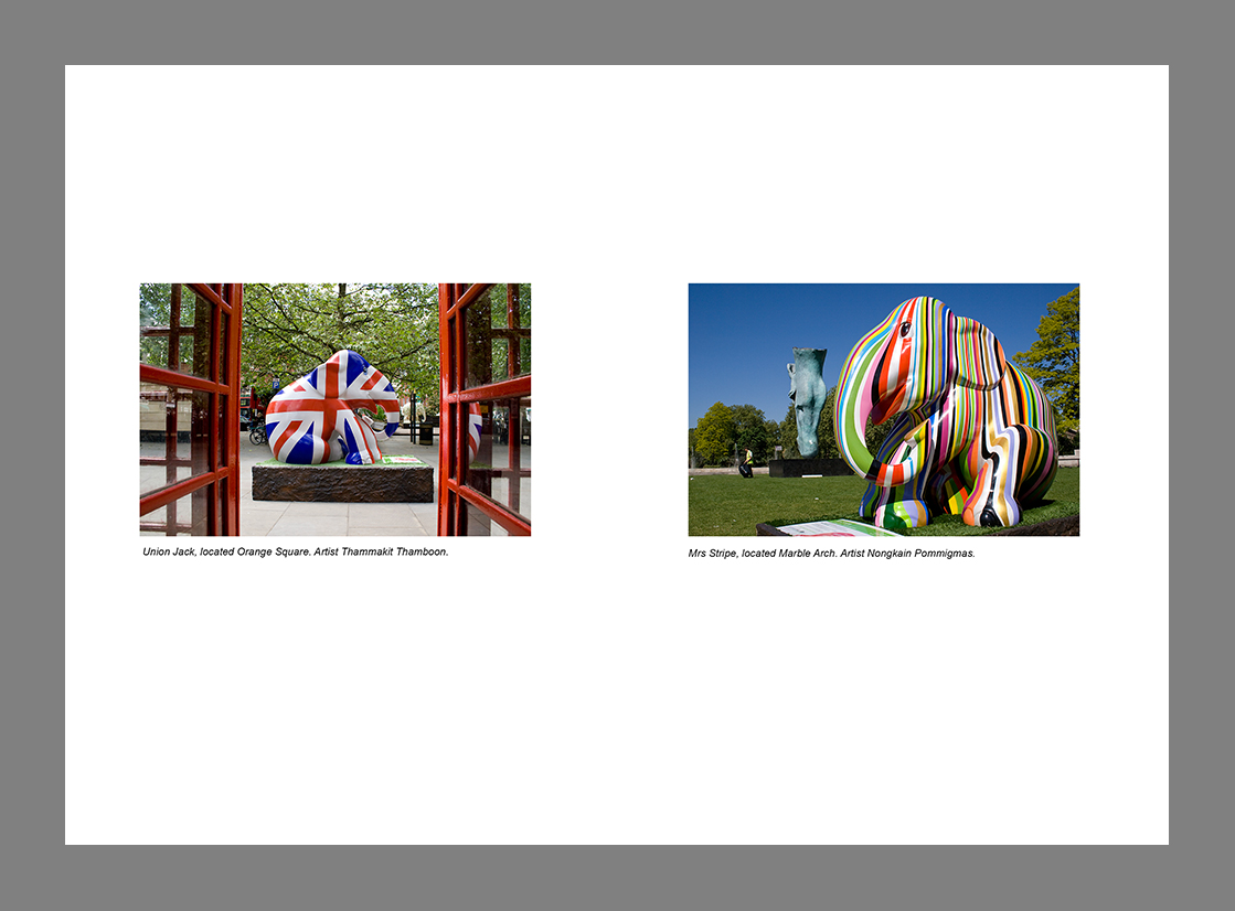
This time I chose to use images of the same size and shape but explore negative space on the page. The images are from the London Elephant Parade 2010 and I felt that the captions explain all you need to know.When placing the images on the page at first they were dead centre but for my liking I preferred there to be more negative space at the bottom. It is only a slight margin but for me was more aesthetically pleasing.
Layout 6

Chosen with the sole reason of experimenting with different subjects, colour, size, shape, time of day etc. this also appears to work. The images show a different face of Milton Keynes so link together which if at first not obvious from the images would be from reading the captions. This has helped me realise the importance of the next exercise of working with picture captions.
Conclusion
In conclusion I decided that you could experiment with layouts and combinations until the cows come home. Whilst there seems to be no obvious rules as to which images can go together in respect of size and shape, there positioning on the page and the content of each picture will have a huge impact on if the layout works or not.
Asked to rank them in order as to how they work.....initial thoughts are :
- Layout 3
- Layout 4
- Layout 6
- Layout 2
- Layout 5
- Layout 1 V2
This may change on reflection. Interesting exercise to do and I have learnt that different shapes and sizes make for a more dynamic layout, that the images don't have to be radically different to work, contrasting pictures do work, same size images have their place but most of all that the direction/content of the final image will have a huge impact on if the spread works or not.
found this which could come in handy for reference
http://inspirationhut.net/inspiration/42-excellent-examples-of-magazine-layout-design-for-your-inspiration/
http://www.magazinedesigning.com/magazine-spreads-good-bad-practices/
found this which could come in handy for reference
http://inspirationhut.net/inspiration/42-excellent-examples-of-magazine-layout-design-for-your-inspiration/
http://www.magazinedesigning.com/magazine-spreads-good-bad-practices/
 |
| This is good example of text flow. Text and images have their own place and importance. Flow is natural and reader will have no problem following it. |
 |
| Gray areas represent the most visible areas of the spread. Darker shaded area is more visible than the lighter shades. Readers eye is drawn to the upper parts that’s why those areas have the most impact. |
No comments:
Post a Comment